
Introduction:
When decorating a room, one of the biggest concerns is whether using multiple colors will make the space feel chaotic. The good news? When done right, layering colors can elevate your space, add personality, and still feel cohesive. It’s all about balance, thoughtful placement, and keeping your color palette in check.
Here’s how to mix two or more colors in a room—and some stylish product picks to help you get started.
1. Start with a Base Color
Choose a base color that grounds the room—neutrals like soft whites, beiges, or grays work perfectly. This will allow your added colors to pop without overwhelming the space.
Product Recommendation:
Rivet Cove Mid-Century Modern Sofa (Stone Gray) – Available on Amazon
Perfect neutral base for your living room that works well with pops of color in cushions or wall art.
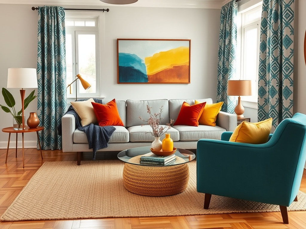
2. Use the 60-30-10 Color Rule
Remember this classic rule:
- 60% dominant color – walls, rugs, large furniture
- 30% secondary color – curtains, chairs, smaller furniture
- 10% accent color – pillows, art, vases
Product Recommendations:
Dominant: NuLOOM Rigo Hand Woven Jute Rug (Natural)
Secondary: Christopher Knight Home Velvet Accent Chair (Teal)
Accent: Abstract Throw Pillows in Rust and Mustard Yellow (Amazon Set of 2)
3. Find a Common Thread
Tie colors together with shared undertones or through patterns.
Product Recommendations:
Rivet Modern Geometric Print Curtains (Navy/Yellow/Gray)
These patterned curtains mix blue, yellow, and gray tones—perfect for pulling your color palette together without feeling forced.
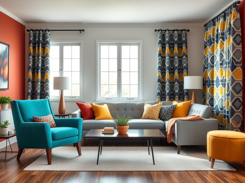
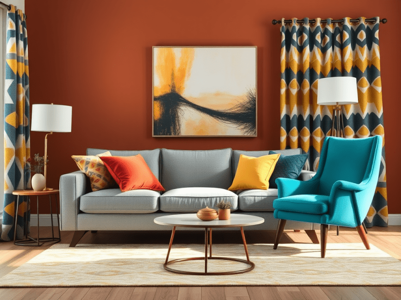
4. Try Color Blocking or Accent Walls
Color blocking can anchor a space without overpowering it. Paint one wall a bold color or introduce a colorful furniture piece.
Product Recommendations:
BEHR Paint in “Canyon Dusk” – A warm terracotta hue that’s perfect for an accent wall.
Or:
Modway Render Mid-Century Modern TV Stand in Walnut and White – Adds both wood tones and a touch of white for balance.
5. Get Inspired by Nature’s Color Combinations
Nature offers perfect color palettes—think greens and browns, blues and sandy tones.
Product Recommendation:
Madison Park Natural Landscape Framed Wall Art – Combines sky blue, earthy browns, and green tones, making it easy to build your color scheme around.
6. Layer with Patterns and Textures
Adding textures and patterns breaks up color blocks and softens the look.
Product Recommendations:
Bedsure Chunky Knit Blanket (Cream or Olive Green) – Adds texture without adding more color intensity.
Stone & Beam Modern Farmhouse Plaid Throw Pillows – Easy way to introduce multiple colors subtly.
7. Use Lighting to Enhance Colors
Good lighting enhances colors and prevents the room from feeling heavy.
Product Recommendations:
Brightech Sky LED Torchiere Floor Lamp (Warm Light) – Provides soft light that enhances warm tones.
Or:
Seaside Village Dimmable Vintage Table Lamp with a Fabric Shade – Great for accenting cooler tones.
Example Color Combinations that Work Well Together
| Palette | Primary Color | Secondary Color | Accent Color |
|---|---|---|---|
| Coastal Calm | Soft Gray | Seafoam Green | Navy Blue |
| Earthy Boho | Warm Beige | Terracotta | Olive Green |
| Modern Glam | Cream | Emerald Green | Gold |
| Vibrant Energy | White | Teal | Mustard Yellow |
Final Thoughts:
The secret to using multiple colors in one room is balance and intention. Let one color lead, the second support, and the third create pops of interest. Patterns, textures, and thoughtful placement ensure the colors don’t compete, but instead, work together to tell a stylish, cohesive story.
💬 Pro Tip: Use color swatches or apps like Sherwin-Williams ColorSnap or Benjamin Moore Color Portfolio to play around with color pairings before committing.
Ready to add color to your space?
Here are some shoppable picks to get started:
- Area Rugs: NuLOOM Jute Rug on Amazon
- Accent Chairs: Teal Velvet Chair by Christopher Knight
- Throw Pillows: Abstract Rust/Yellow Set of 2
- Wall Art: Natural Landscape Framed Art
- Lighting: Brightech Sky LED Torchiere Lamp
What color combinations do you love? Drop your ideas in the comments!

Leave a comment