
Color is one of the most powerful tools in home design. It influences mood, sets the tone of a room, and reflects your personality more than almost anything else in your décor. But when it comes to mixing colors, many people hesitate—worried that combining too many hues might look “too busy” or “off balance.”

The truth? Mixing colors is not only okay… it’s encouraged. The key is knowing how to blend them with intention.
Why Do People Mix More Than One Color in a Room?
Most rooms aren’t defined by a single note—they’re symphonies. Mixing colors allows you to:
1. Create Visual Interest
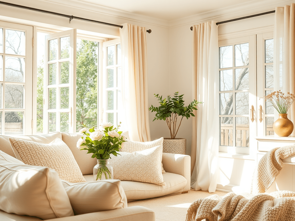
Using multiple colors makes a room feel more dynamic. Even neutral lovers can benefit from adding small pops of color to prevent a space from feeling flat.
2. Reflect Your Personality
No two homes (or people!) are the same. Mixing colors lets you tell your story—whether you want bold, playful energy or soft, calming vibes.
3. Define Different Zones
Open-concept layouts especially benefit from mixed colors. Each section can have its own unique mood while still maintaining overall cohesion.
4. Add Depth and Dimension
Color layering—light, medium, and dark tones—creates depth that makes a room feel complete and professionally designed.
Is It Okay to Mix Different Colors?
Absolutely. The fear of “too much color” usually comes from not understanding how colors relate to one another. When mixed thoughtfully, color creates harmony—even in spaces with bold or unexpected pairings.
The secret lies in using intentional combinations, consistent undertones, and a balanced ratio (for example, the 60-30-10 rule: 60% main color, 30% secondary color, 10% accent color).
Perfect Color Combinations That Always Work
Here are some tried-and-true color palettes for 2025 and beyond:
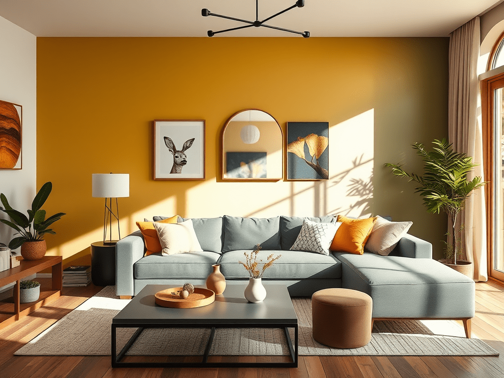
1. Navy + Mustard + Cream
Sophisticated yet warm, this trio flows beautifully in living rooms and dining spaces.
2. Sage Green + Terracotta + Natural Wood
Earthy, modern, and perfect for creating a calm sanctuary.
3. Charcoal Gray + Soft Blush + White
A gentle but elevated combination often found in minimalist or Scandinavian homes.
4. Forest Green + Gold + Matte Black
Bold, moody, and luxe—ideal for offices, bedrooms, and accent walls.
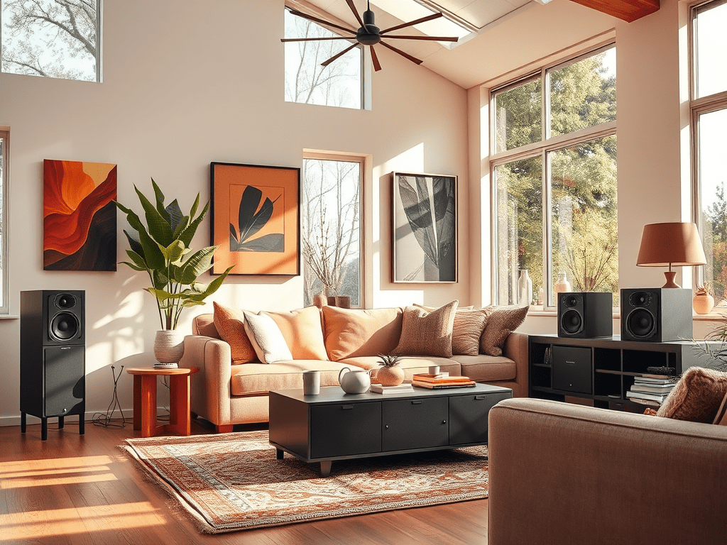
5. Warm Beige + Olive + Burnt Orange
A modern twist on neutrals that fits perfectly with 2025’s earthy, grounded aesthetics.
6. Deep Plum + Champagne + Warm Gray
Elegant and unexpected—great for bedrooms or formal spaces.
How to Mix Colors Successfully
1. Start With One Anchor Color
Choose your dominant shade first—something that supports the feeling you want (calming, energizing, cozy, airy, etc.).
2. Choose Complementary or Analogous Colors
- Complementary colors sit opposite each other on the color wheel (blue + orange, yellow + purple).
- Analogous colors sit next to one another (greens + blues, oranges + reds).
Either approach works beautifully.
3. Follow the 60-30-10 Rule
- 60% main color (walls, larger furniture)
- 30% secondary color (rugs, curtains, bedding)
- 10% accent color (decor, flowers, pillows)
This creates natural balance.
4. Use Patterns to Tie Colors Together
Throw pillows, rugs, art prints, and blankets are your best friends here. A patterned item containing multiple colors helps everything make sense visually.
5. Pay Attention to Undertones
Mixing cool undertones and warm undertones can work, but it requires intention. If you’re new to color mixing, stick to one undertone family.
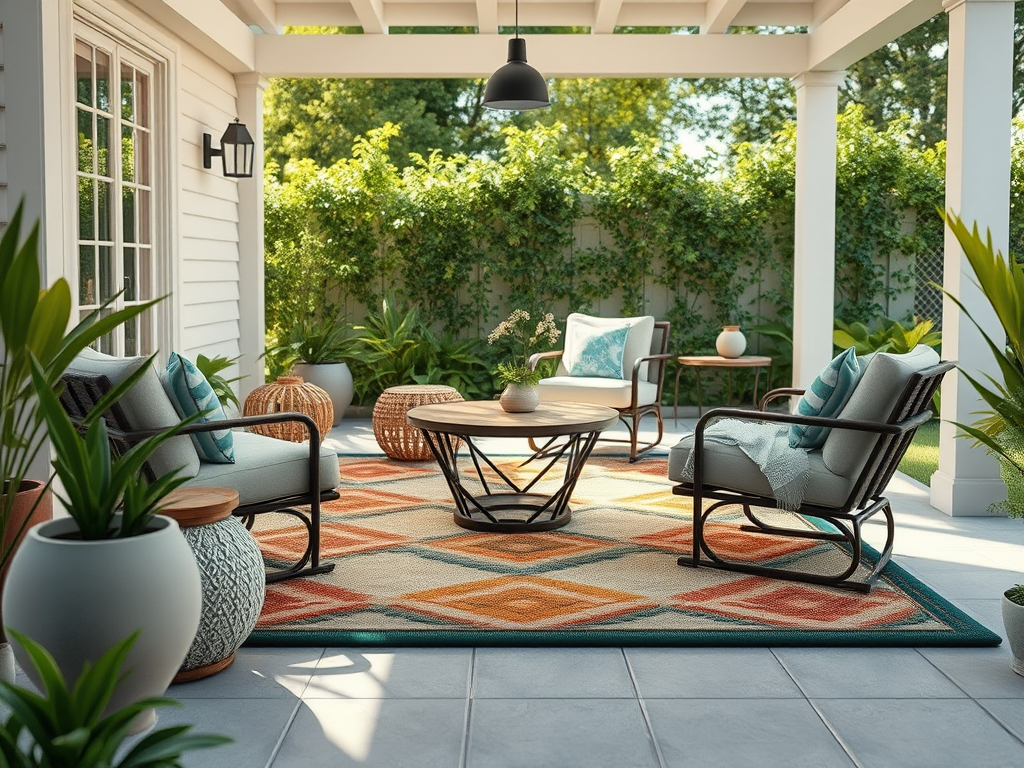
6. Bring in Natural Elements
Wood, greenery, stone, and metals act as neutral “buffers” that help different colors blend effortlessly.
Popular Color Trends for 2025
2025 is full of rich, grounded, and expressive tones. Here’s what’s showing up everywhere in design:
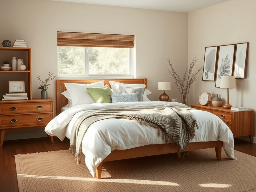
1. Earth-Rooted Neutrals
Warm beige, clay, brown, and tan are replacing stark whites and grays.
2. Moss & Olive Greens
Nature continues to inspire interior color choices, and greens remain reigning favorites—especially muted moss and deep olive.
3. Sunset-Inspired Colors
Muted coral, terracotta, apricot, and dusty rose remain strong for 2025—warm, nostalgic, and comforting.
4. Midnight Blues & Moody Charcoal
Deep, dramatic colors create cozy high-end vibes.
5. Soft Lavender & Dusty Plum
Romantic, unexpected purples are trending for bedrooms and accent walls.
6. Black as an Accent
Black is still the go-to for grounding a space. A single black element adds structure and sophistication.

Final Thoughts
Mixing colors isn’t about following strict rules—it’s about creating a space that feels right for you. Whether you prefer bold contrasts or soft harmonious tones, the right color combinations can elevate any room and transform your home into a reflection of your personality.

Leave a comment