
There’s a moment almost everyone experiences when decorating a home.
You’re standing in a space that’s empty—or one that no longer feels like you—and you think, “I want this to feel better.” Calmer. Softer. More aligned with where I am right now.
And without overthinking it, you reach for neutral colors.
White. Beige. Cream. Gray. Taupe.
Not because you lack creativity.
Not because you’re afraid of bold choices.
But because neutral colors feel like the safest, most natural place to begin.
Neutral tones aren’t just a design decision. They’re an emotional starting point.
Why Neutral Colors Feel Like Home Before Anything Else
Neutral colors don’t demand attention. They don’t overpower a space or tell you how you’re supposed to feel. Instead, they create room—room for comfort, for personality, for life to happen.
They:
- Create visual calm
- Make spaces feel open and breathable
- Reduce overwhelm
- Allow the eye to rest
When life already feels loud, busy, or transitional, neutral tones ground us. They quietly say, You’re safe here.
That’s why they’re often the first choice—especially when decorating a new home, starting over, or redefining your space after a life shift.
The Psychological Reason We Always Start with Neutrals
Decorating is rarely just about aesthetics. It often happens during moments of change:
- Moving into your first place
- Buying a home
- Redecorating after burnout, growth, or loss
- Wanting your space to finally reflect who you’ve become
Neutral colors feel emotionally safe because they don’t force an identity before you’re ready.
They give you permission to evolve.
Instead of committing to a bold statement right away, neutrals offer a foundation that lets you figure things out over time—without pressure or regret.
A Brief History of Neutral Colors in Home Decor
Neutral tones didn’t start as a trend—they began as a necessity.
Early Homes: Practical and Natural
Historically, homes were built using what was readily available: stone, plaster, wood, and clay. These materials naturally produced neutral interiors long before “minimalist” was a design term.
The Rise of Modernism
In the early 20th century, designers emphasized simplicity, function, and light. Figures like Le Corbusier promoted clean lines and white interiors as symbols of clarity and modern living.
Mid-Century and Open Living
As homes became more open and furniture more expressive, neutral backdrops allowed architecture and design details to shine. Warm woods, soft creams, and muted grays became staples that tied spaces together.
Today, in open-concept homes especially, neutral palettes help rooms flow naturally instead of feeling visually chaotic.
Neutral Doesn’t Mean One Thing: Popular Palettes by Feeling
Neutral colors aren’t boring—they’re versatile. The magic is in choosing the right neutral for the mood you want to create.
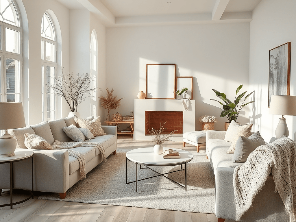
Soft & Serene
- Warm whites
- Cream
- Pale beige
- Linen tones
Perfect for bedrooms and bathrooms, these shades feel calm and restorative.
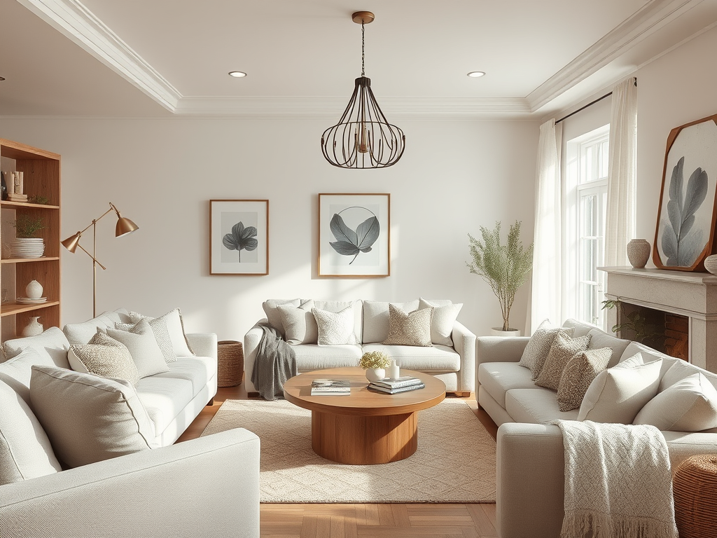
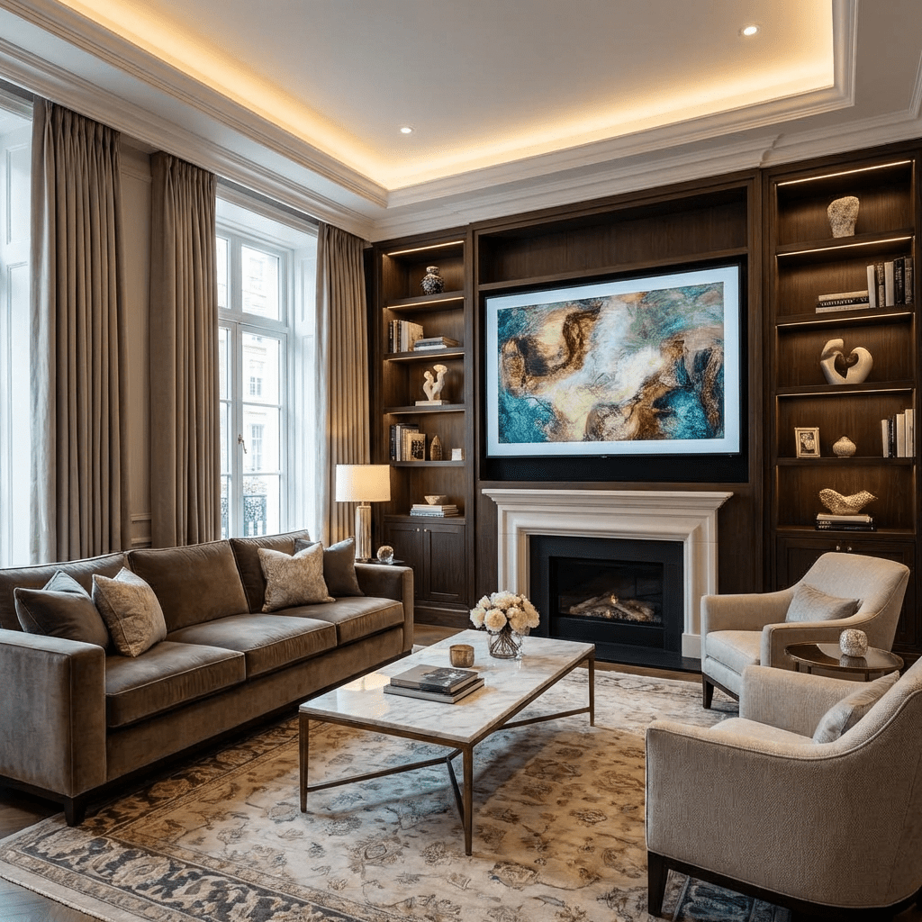
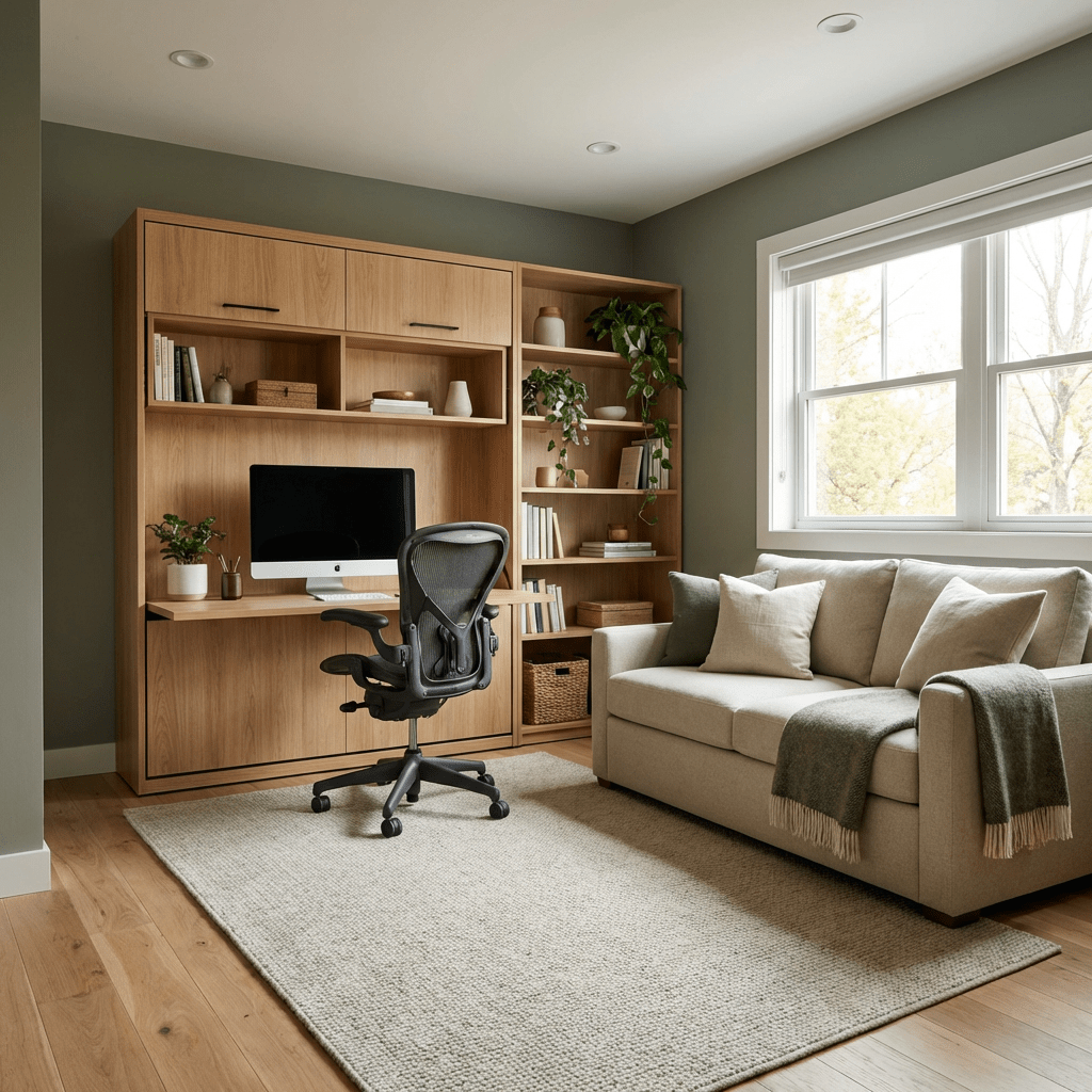
Warm & Cozy
- Beige
- Taupe
- Warm greige
- Soft caramel
Ideal for living rooms and gathering spaces, creating comfort and warmth.
Modern & Clean
- Cool white
- Light gray
- Charcoal accents
Great for contemporary homes that lean sleek and structured.
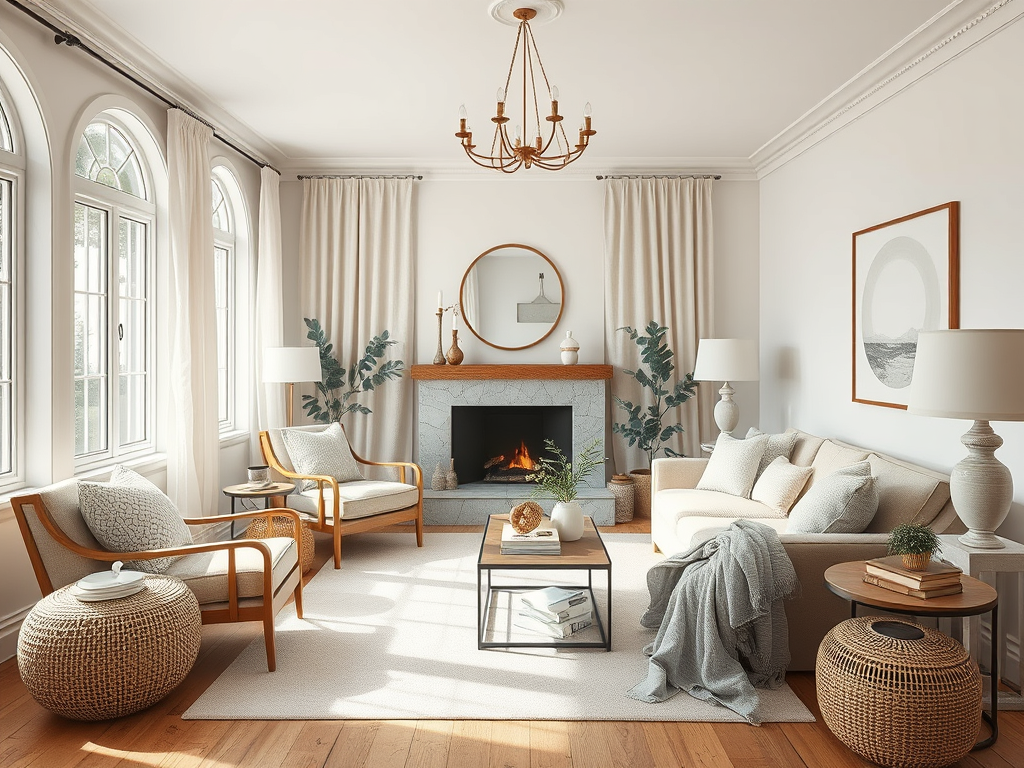
Earthy & Organic
- Mushroom
- Putty
- Sand
- Clay
Grounded and natural, these tones feel timeless and connected to nature.
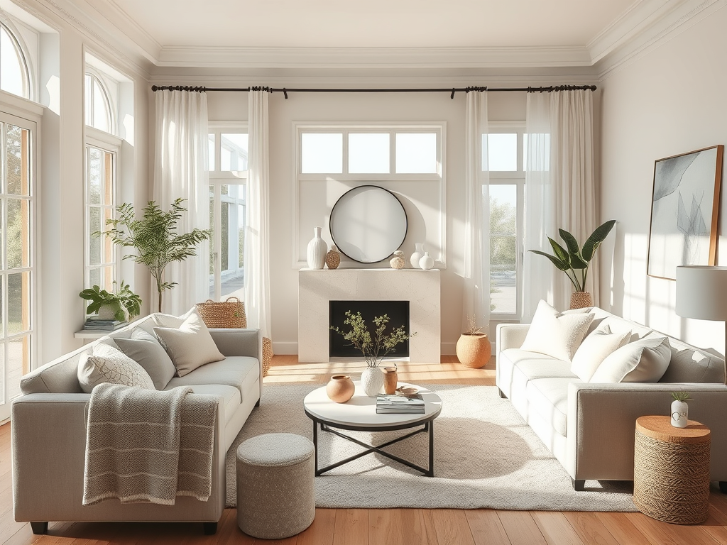
Why Neutrals Still Dominate Modern Decor Trends
Neutral colors haven’t stayed popular by accident—they’ve adapted.
Today’s neutral trend focuses on:
- Warm over cool: Cooler grays are fading, replaced by softer, warmer tones
- Texture over color: Linen, boucle, wood, and stone add depth
- Monochrome layering: Multiple shades of the same neutral create richness
- Intentional contrast: Black accents, aged brass, or natural wood keep spaces dynamic
Modern neutrals feel lived-in, not sterile—and that’s why they last.
Neutrals Make Decorating Easier (and Smarter)
A neutral foundation allows you to:
- Change decor seasonally
- Swap furniture without repainting
- Evolve your style over time
- Avoid trend fatigue
Instead of redecorating from scratch, you layer your space—pillows, rugs, art, lighting—while the base remains steady.
It’s not about playing it safe. It’s about building a home that grows with you.
Neutral Colors Don’t Erase Personality—They Highlight It
Your personality doesn’t live in paint alone.
It lives in:
- The art you choose
- The furniture you invest in
- The textures you layer
- The memories tied to your pieces
Neutral walls don’t dull your story. They give it space to be seen.
Why Neutral Colors Are Always Where We Begin
We begin with neutral colors because they:
- Feel grounding and familiar
- Support emotional comfort
- Offer design flexibility
- Stand the test of time
Neutral tones aren’t the absence of style—they’re the starting point of intention.
They allow your home to be unfinished, evolving, and real.
And sometimes, the quietest colors create the strongest sense of belonging.
That’s why we always start there. 🤍
Final Thought
Neutral colors are so often the center of home decor because they do something powerful without asking for attention. They create balance when life feels busy, comfort when change is happening, and flexibility when personal style is still evolving. Neutrals don’t rush decisions or demand perfection—they allow a home to grow naturally, one layer at a time. By grounding a space, they make room for personality, memories, and meaning to shine. That’s why so many people return to neutral tones again and again—not because they’re safe, but because they make a home feel steady, intentional, and truly lived in.

Leave a comment