
Color is one of the most powerful design tools in home decor. It shapes how we feel in a space, how big or small a room appears, and even how cozy or refreshing it feels. But one of the most common design dilemmas many homeowners face is deciding between dark and light colors—and even more importantly, learning how to pair them together.
Let’s explore the beauty behind both dark and light tones, how to pair them effectively, and why our color choices say so much about who we are and how we want to live.
The Appeal of Light Colors
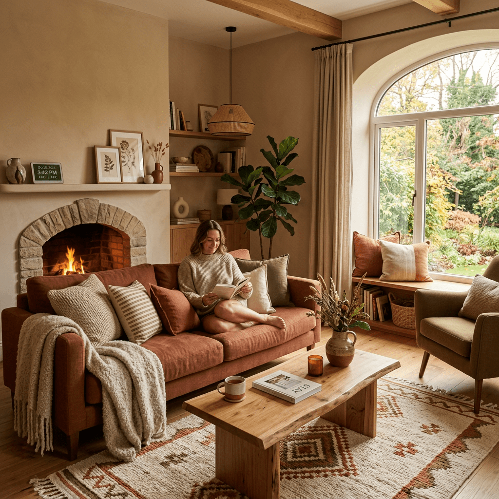
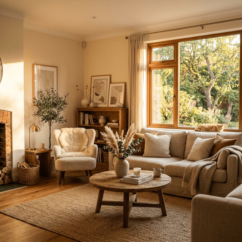
Light colors—think whites, creams, beiges, pale grays, and pastels—are loved for their ability to make a space feel open, airy, and bright. They reflect light, making small rooms feel larger and more inviting.
A light color palette often creates a peaceful, calm environment, perfect for bedrooms, bathrooms, and spaces where you want to relax or unwind.
Common light color moods:
- White & Cream: Freshness and simplicity
- Pale Gray: Modern and balanced
- Soft Blues & Greens: Tranquility and calm
- Blush & Beige: Warmth and approachability
The Strength of Dark Colors
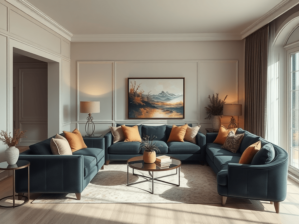
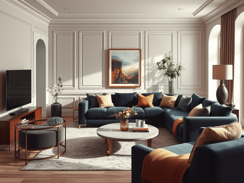
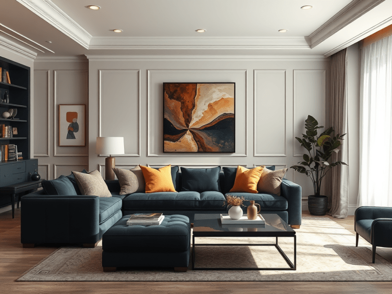
Dark colors—like navy, charcoal, emerald, or espresso—bring a sense of depth, drama, and sophistication. They absorb light rather than reflect it, making a room feel cozier, more intimate, and often more luxurious.
Dark hues can anchor a space, providing contrast and visual weight. They’re especially effective when you want to create a focal point or highlight certain areas, such as a statement wall or a bold piece of furniture.
Common dark color moods:
- Navy Blue: Confidence and timeless style
- Charcoal or Black: Sophistication and grounding
- Forest Green: Nature-inspired elegance
- Deep Burgundy or Plum: Warmth and richness
Why Dark Works So Well with Light
Pairing dark and light colors creates balance—a visual push and pull that keeps the eye interested. Light colors lift a room, while dark tones ground it. When used together, they prevent a space from feeling too sterile or too heavy.
Think of it like this:
- The light tones provide brightness and openness.
- The dark tones add definition and contrast.
It’s this dynamic contrast that brings dimension to a space, making it feel layered and thoughtfully designed.
How to Pair Light and Dark Colors
Here are a few tried-and-true strategies for mixing both palettes effectively:
- Follow the 60-30-10 Rule:
- 60% light (walls, large surfaces)
- 30% dark (furniture, flooring, or accent walls)
- 10% accent color (decor, art, or textiles)
- Anchor with Dark Elements:
Use darker shades on pieces that stay grounded—like sofas, cabinetry, or rugs—and keep lighter tones on walls or curtains to open up the space. - Use Textures to Soften Contrast:
A soft cream throw on a dark navy couch or a black metal lamp against a pale wall adds texture and balance without overwhelming the eye. - Bring It Together with Neutrals:
Warm neutrals like taupe, gray, or beige can bridge the gap between dark and light tones, creating harmony throughout the room.
Beautiful Light and Dark Color Combinations
Need inspiration? Here are a few combinations that never go out of style:
- Navy Blue + Soft White – Timeless, nautical, and crisp
- Charcoal Gray + Blush Pink – Moody yet romantic
- Forest Green + Cream – Natural and grounded
- Black + Light Oak Wood – Modern and minimalist
- Chocolate Brown + Sky Blue – Earthy and balanced
- Deep Burgundy + Pale Gray – Warm with subtle sophistication
Why We Choose the Colors We Do
Color choices are deeply personal—they reflect emotion, personality, and even mood.
- If you’re drawn to light colors, you likely crave peace, simplicity, and clarity in your space.
- If dark colors appeal to you, you might love the feeling of coziness, strength, and sophistication.
- And if you love pairing both, you’re seeking balance—creating a space that feels grounded yet full of light.
Ultimately, the best color palette is the one that feels like you. Whether your heart leans toward airy whites or dramatic darks, the key is to create contrast that feels natural and intentional.
Final Thoughts
The magic of interior design lies in balance—and color is the heartbeat of that balance. Light and dark shades each have their strengths, but when paired together, they can transform a home into a place that feels dynamic, comfortable, and complete.
So next time you’re choosing paint, furniture, or decor, remember: it’s not about picking one over the other—it’s about how light and dark work together to create harmony in your space.


Leave a comment