When decorating your home, it’s easy to fall back on safe choices—soft neutrals, muted palettes, or shades that blend seamlessly. But what if your space could radiate personality, vibrancy, and energy just by leaning into color contrast? Using colors that oppose each other can feel daring, but when balanced well, it transforms an ordinary room into a standout statement.
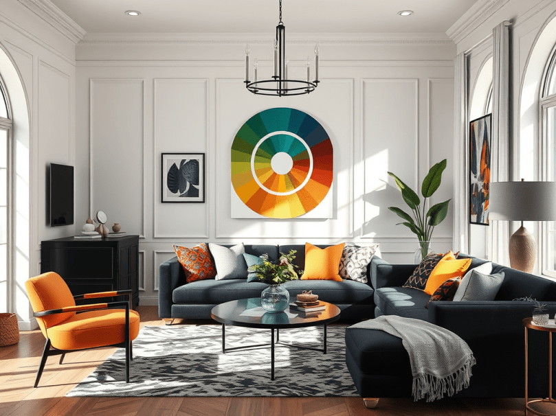
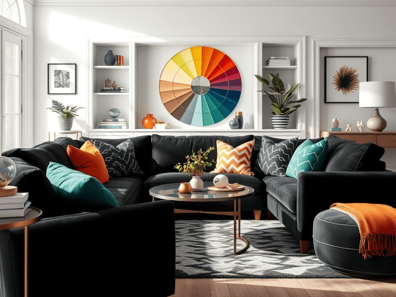
Understanding the Color Wheel
To truly embrace contrasting colors, it helps to know the basics of the color wheel:
- Primary Colors: Red, blue, yellow. These form the foundation.
- Secondary Colors: Green, orange, purple. These are made by mixing primaries.
- Complementary Colors: Opposite each other on the wheel, like blue & orange, red & green, yellow & purple. These pairs create the strongest contrast and instantly draw the eye.
Designers often use complementary contrast to create bold, eye-catching spaces while balancing them with neutrals or textures to keep things harmonious.
Why Contrast Works in Home Design
Our eyes are naturally drawn to contrast—it creates movement, interest, and balance. Without it, rooms can feel flat or unfinished. Contrast highlights shapes, makes colors pop, and adds depth. It’s the secret to giving your home that “wow” factor.
Inspirational Ways to Use Contrast
1. Modern Drama: Black & White with a Twist
Start with the classic high-contrast base of black and white. Add one bold accent color—like emerald green or fire-engine red—for a sleek, modern edge. A black sofa with crisp white walls and golden-yellow throw pillows? Instant sophistication.
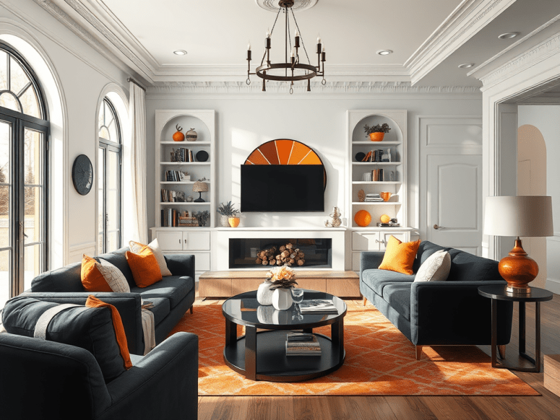
2. Playful Pop: Blue & Orange
This is one of the boldest complementary duos. Think navy walls with burnt-orange accents—pillows, rugs, or even a cozy armchair. The mix feels both vibrant and balanced, especially when anchored with wood tones.
3. Earthy Eclectic: Purple & Yellow
Perfect for boho-inspired spaces. Pair a deep plum rug with mustard-gold curtains or artwork. Layer in natural textures—rattan, linen, or plants—to soften the look while still celebrating contrast.
4. Soft Boldness: Green & Pink
For those who want something striking but not overwhelming, this pairing is versatile. A blush sofa against a forest-green wall feels fresh and calming while still packing a punch.
Tips for Making Contrast Work
- Follow the 70/20/10 Rule: Use one main color (70%), a contrasting accent (20%), and a third pop or neutral (10%).
- Ground with Neutrals: White, beige, or gray keep bold pairings from feeling chaotic.
- Experiment with Textures: Contrasting colors look best when layered with different finishes—velvet against wood, matte paint with glossy tile.
- Start Small: If you’re hesitant, begin with throw pillows, artwork, or a rug before committing to paint or furniture.
- Match the Mood: Bright contrasts energize (perfect for kitchens or living rooms), while softer contrasts soothe (ideal for bedrooms or bathrooms).
Try This at Home
- Add a pair of contrasting throw pillows to your sofa.
- Paint a contrasting accent wall behind your bed or desk.
- Introduce a bold rug with colors opposite your current decor.
- Use artwork to experiment with contrasts before committing to bigger changes.
Final Thoughts
Embracing contrasting colors isn’t about clashing—it’s about balance, energy, and expression. When you step away from “safe” color pairings, you open the door to a home that feels alive, unique, and undeniably you.
So next time you’re choosing decor, don’t just ask, “What matches?” Ask instead: “What contrasts beautifully?” That’s where the magic happens.