Shades of Blue: Why This Timeless Color is So Popular in Home Decor


Blue is one of the most beloved colors in the world. From calming ocean waves to the clear sky on a sunny day, the color blue carries a sense of peace, serenity, and depth. But have you ever wondered why blue is so popular in home decor? Beyond its natural beauty, blue has a rich history, countless variations, and endless creative possibilities that make it a go-to choice for homeowners and designers alike.

A Brief History of Blue in Home Decor

The history of blue in design stretches back centuries. In ancient times, blue pigments were rare and expensive, often reserved for royalty, religious art, and symbols of prestige. Egyptian art frequently showcased blue as a symbol of protection and rebirth. By the Middle Ages, ultramarine—derived from the semi-precious stone lapis lazuli—was prized in paintings and decorative work, symbolizing heaven and divine truth.

As dye-making and paint technology advanced, blue became more accessible. In the 18th and 19th centuries, blue-and-white ceramics gained popularity, especially in Europe and Asia. By the 20th century, blue emerged as a staple in interior design, thanks to its versatility and ability to complement almost any palette. Today, blue continues to reign as one of the most favored home colors, beloved for both tradition and trend.

Why Is Blue So Popular?

There’s more to blue’s popularity than just aesthetics:

  • Calming effect: Psychologists agree that blue evokes feelings of peace and relaxation, making it perfect for bedrooms, bathrooms, and other spaces designed for rest.
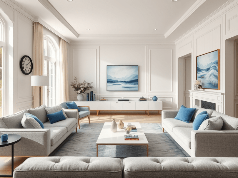
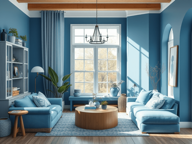
  • Versatility: Blue can be light and airy, bold and dramatic, or muted and sophisticated. It works equally well in traditional and modern spaces.
  • Universality: Unlike some colors, blue appeals to almost everyone. It’s seen as trustworthy, timeless, and approachable.
  • Connection to nature: Blue naturally reminds us of the sky and water—elements that soothe and ground us.

Shades of Blue to Explore

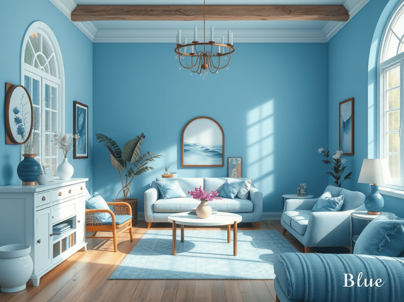
Blue isn’t just one color—it’s a family of hues, each creating a unique mood. Some popular variations include:

  • Navy Blue: Classic, elegant, and strong. Perfect for accent walls or upholstery.
  • Sky Blue: Light and breezy, ideal for creating an open, airy atmosphere.
  • Teal: A bold mix of blue and green that adds vibrancy and sophistication.
  • Powder Blue: Soft and delicate, great for nurseries, bathrooms, and bedrooms.
  • Cobalt Blue: Bright and lively, a striking choice for accent decor.
  • Dusty Blue: Muted and romantic, a favorite for farmhouse or vintage-inspired spaces.

Untraditional Ways to Use Blue in Your Home

While walls and textiles are the most common uses of blue, there are plenty of creative ways to bring this color into your space:

  • Blue Ceilings: A nod to “haint blue” porches in the South, painting your ceiling in a light shade can make a room feel taller and brighter.
  • Blue Kitchen Cabinets: Move over white—navy and cobalt cabinets are chic, modern, and unexpected.
  • Blue Flooring: Patterned blue tiles in bathrooms or kitchens can create a stunning, artistic focal point.
  • Blue Appliances: Retro-inspired blue refrigerators, stoves, or mixers bring personality to the kitchen.
  • Statement Furniture: A velvet navy sofa or a turquoise armchair can act as a bold anchor piece in a neutral room.
  • Art & Accessories: Instead of paint, bring in blue through oversized artwork, ceramics, or even a gallery wall with hints of blue woven throughout.

Final Thoughts

Blue is more than just a color—it’s a feeling, a tradition, and a design tool that has stood the test of time. Whether you lean toward soft pastels or dramatic navy tones, incorporating shades of blue can add beauty, calm, and sophistication to your home.

So, the next time you’re choosing a color for a room refresh, think about blue. With its rich history, universal appeal, and endless variations, it may just be the perfect shade your home is missing.


Feeling Blue in the Best Way: How to Decorate with Blue Without Overpowering Your Space


Do you love the color blue? You’re not alone! Blue is one of the most beloved colors in home decor—and for good reason. It’s calming, classic, and surprisingly versatile. Whether you’re dreaming of a serene spa-like bathroom, a cozy navy reading nook, or just want to sprinkle in some subtle sky blue touches, this color has something for everyone.

But if you’re wondering how to incorporate blue into your home without it taking over or clashing with your existing style, you’re in the right place. Let’s explore the many shades of blue and which colors pair beautifully with them to create balance, depth, and harmony in your home.


A Little Blue Love Story

Let me tell you a quick story.

Growing up, I had a favorite blue blanket. It was soft, worn in all the right places, and had tiny stars stitched across it—faded from too many washes but still perfect. No matter how many new throws came into the house, that blue one? It always found its way to the couch.

Years later, I moved into my first apartment and found myself drawn to a navy velvet pillow in a little home boutique. I didn’t realize it then, but the moment I brought that pillow home, something clicked. Blue wasn’t just a color. It was comfort. It was home. It was mine.

Since then, blue has made its way into every space I’ve lived in. Whether it’s a powder blue vase, a teal kitchen towel, or a deep ocean blue wall in my office, that color still wraps me in the same warmth as that old childhood blanket.


Popular Shades of Blue and Their Perfect Pairings

Blue isn’t just blue. It ranges from soft and subtle to bold and dramatic. Here’s a list of shades to consider and what they pair well with:

1. Sky Blue

Light, airy, and sweet—perfect for ceilings, nurseries, or bathrooms.

Pairs best with:

  • White (for a fresh, clean vibe)
  • Soft yellows (for a sunny feel)
  • Light grays or tans (for a relaxed, coastal style)

2. Navy Blue

Deep and moody—great for accent walls, cabinets, or upholstered furniture.

Pairs best with:

  • Crisp white (for a timeless nautical look)
  • Brass or gold accents (for a rich, luxurious feel)
  • Blush pink or coral (for a trendy, unexpected contrast)

3. Teal

A mix of blue and green—bold, energetic, and modern.

Pairs best with:

  • Warm wood tones (for balance and grounding)
  • Mustard yellow or burnt orange (for a retro flair)
  • Creamy neutrals (to soften the vibrancy)

4. Powder Blue

Subtle and peaceful—ideal for bedrooms, offices, or vintage-inspired spaces.

Pairs best with:

  • Ivory or white
  • Pale rose or lavender
  • Light wood finishes

5. Cobalt Blue

Vibrant and bold—perfect as a statement color in kitchens or bathrooms.

Pairs best with:

  • White and black (for high contrast and drama)
  • Lemon yellow (for a pop of playfulness)
  • Metallics like chrome or silver

6. Steel Blue

Muted with a gray undertone—great for a modern or masculine touch.

Pairs best with:

  • Charcoal gray or black
  • Olive green
  • Warm leather or natural textures

Tips to Use Blue Without Overpowering Your Space

  • Use blue as an accent color: Add blue throw pillows, artwork, or a rug to test the waters before committing to a big blue piece.
  • Balance it with neutrals: White, beige, and gray help keep the space feeling open and not too dark or heavy.
  • Layer different shades: Mixing light and dark blues can add dimension without being overwhelming. Think a navy chair with a sky-blue blanket or multiple blue-toned wall prints.
  • Bring in natural elements: Wood, greenery, and woven textures can soften and balance the coolness of blue tones.

Final Thoughts: Blue Your Way

Blue is more than just a color—it’s a feeling. It’s comfort. It’s peace. It’s depth and expression. Whether you’re choosing a bold navy velvet couch or just want to sprinkle in a few ocean-toned accents, you can bring the magic of blue into your home in a way that feels intentional and personal.

So, are you a navy night owl or a sky-blue dreamer? Let me know your favorite shade in the comments—or share a sweet blue memory from your home.