
Tag: LIVING ROOM
-
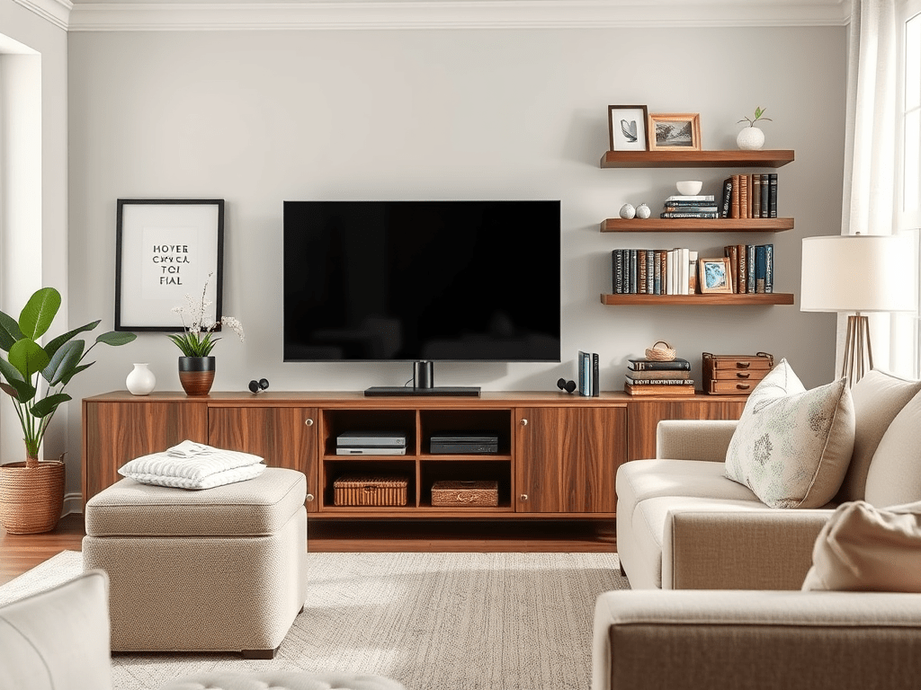
If your living room looks more like a tech hub than a cozy hangout, you’re not alone. Movies, video games, consoles, controllers, electronics, and all…
-
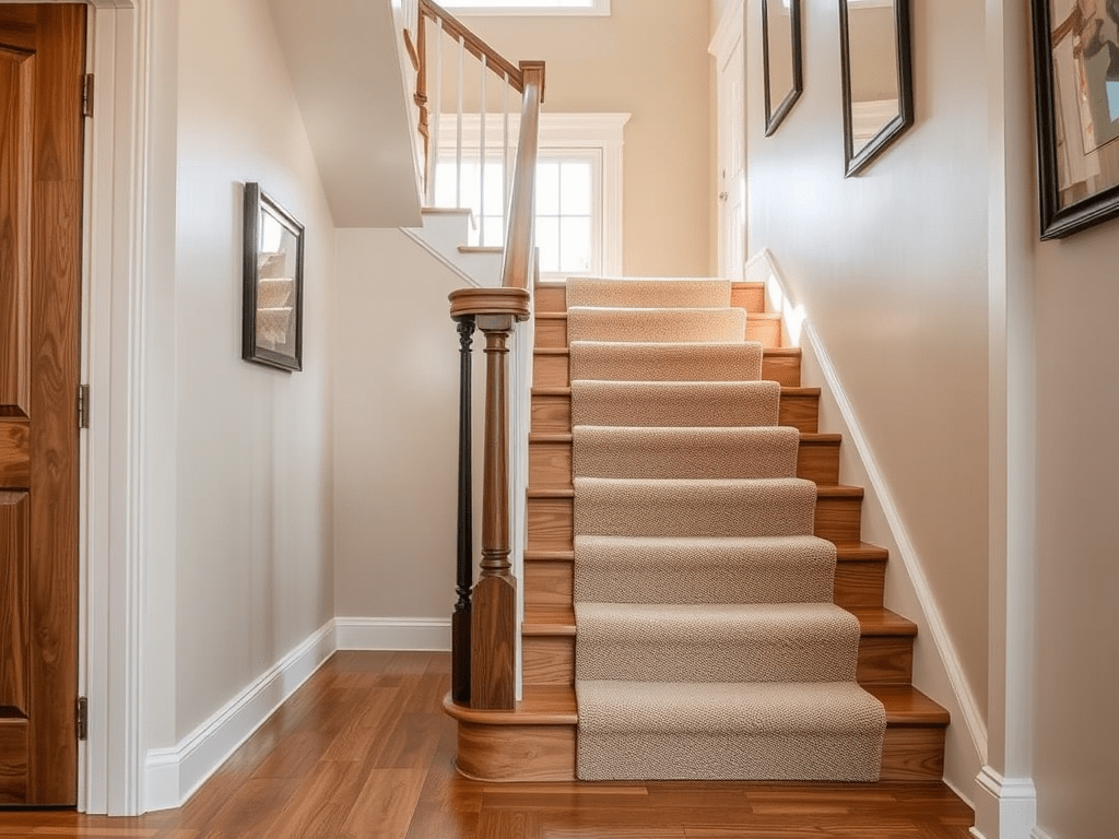
When it comes to designing your home, stairs often become the unexpected centerpiece. They connect your spaces, draw the eye, and, yes, they endure a…
-
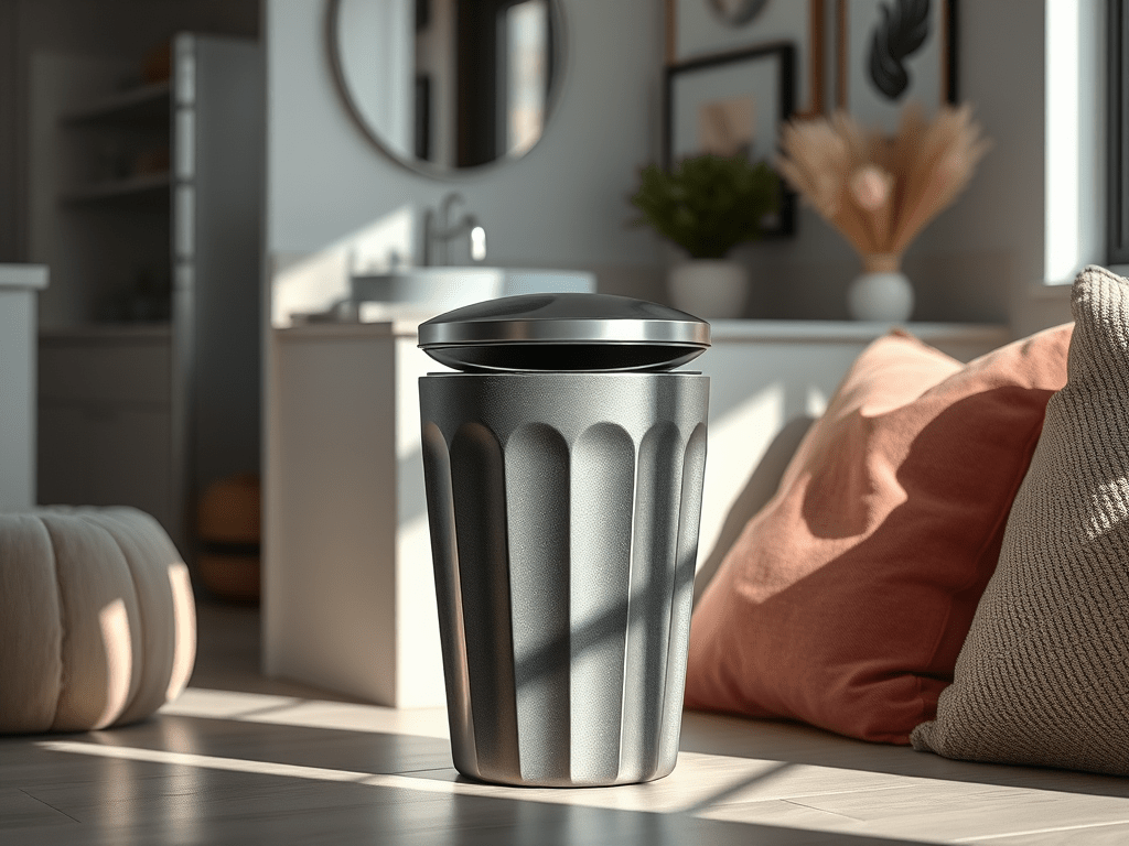
Let’s be honest — when you think about decorating your home, garbage cans probably aren’t the first thing that comes to mind. You fuss over…
-
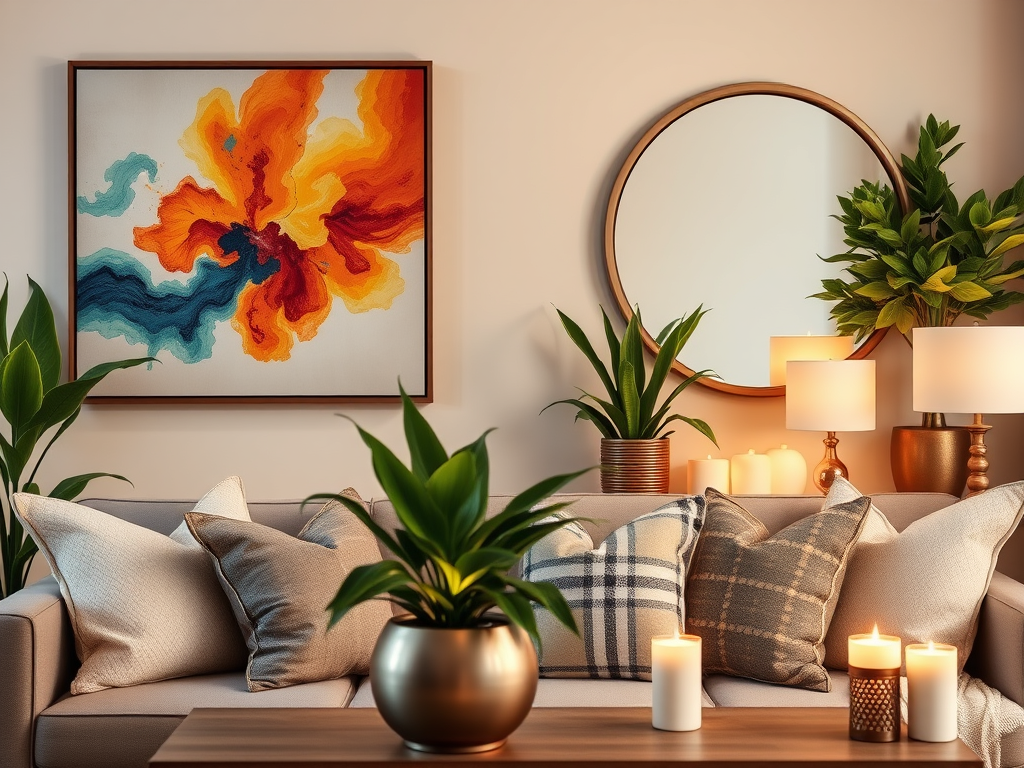
Every home has its unsung champions — those decor pieces that elevate a room from “nice” to noticeable. Whether you’re styling your first place, refreshing…
-
There’s a moment almost everyone experiences when decorating a home. You’re standing in a space that’s empty—or one that no longer feels like you—and you…
