How to Choose the Perfect Wall Color for Your Home


So, you’ve just moved in — the boxes are unpacked, the furniture’s in place, and your walls are… bland. Bare. Maybe that standard shade of “builder’s beige” that feels more like a placeholder than a personal choice. Now comes the fun part: choosing the wall colors that will make your home truly yours.

But where do you even start? With so many shades, tones, and finishes out there, choosing a wall color can feel overwhelming. Don’t worry — here’s how to narrow it down and find the color that makes each room pop.


1. Start with the Feeling You Want

Every color brings a mood into a room. Before you pick up a paintbrush, think about how you want to feel in that space.

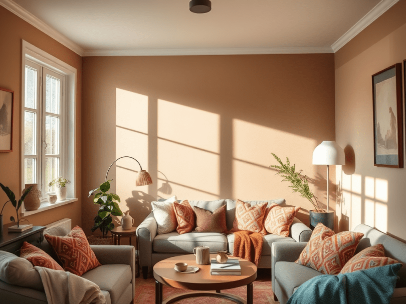
  • Living Room: Warm, cozy tones like soft taupe, creamy beige, or even a muted olive green can make the room feel inviting.
  • Bedroom: Think calm and restful. Blues, lavenders, or soft neutrals are perfect for winding down.
  • Kitchen or Dining Area: Energizing colors like light yellows, sage greens, or crisp whites bring life and freshness to your everyday routine.

When you identify the vibe you’re going for, choosing a color becomes so much easier.


2. Look at What You Already Have

Your walls shouldn’t compete with your furniture — they should complement it. Take a look around at your flooring, rugs, and larger pieces. Do you notice warm undertones (like red, orange, or gold) or cool ones (like blue, gray, or green)?

If your decor leans warm, you might love creamy off-whites, terracotta, or warm grays. If it leans cool, try crisp whites, misty blues, or charcoal tones.

A simple trick: grab a throw pillow or curtain panel you love and pull color inspiration from there.


3. Test Before You Commit

Paint samples are your best friend. A color that looks perfect under store lighting might look completely different in your home.

Buy small sample cans and paint swatches directly on the wall — or use peel-and-stick samples to see how the color shifts throughout the day. Look at it in morning light, afternoon sunlight, and evening lamps. The best wall color looks good in every lighting condition.
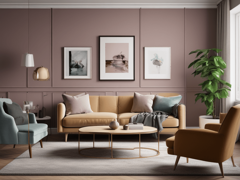

4. Think About Flow

If your home has an open floor plan, try choosing a main color that flows from one room to another. You can still add personality by using accent walls or slightly darker/lighter shades in connected areas.

This creates a cohesive, well-balanced feel — especially if your furniture and decor already vary in color or pattern.


5. Don’t Forget the Finish

Once you’ve chosen your color, the next step is picking the right finish:

  • Matte or Flat: Hides imperfections but is harder to clean (great for bedrooms and ceilings).
  • Eggshell or Satin: Soft sheen and easy to clean (perfect for living rooms and hallways).
  • Semi-Gloss or Gloss: Adds shine and durability (best for kitchens, bathrooms, and trim).

The finish can subtly change how your color looks once it’s on the wall — so it’s worth taking the time to choose carefully.


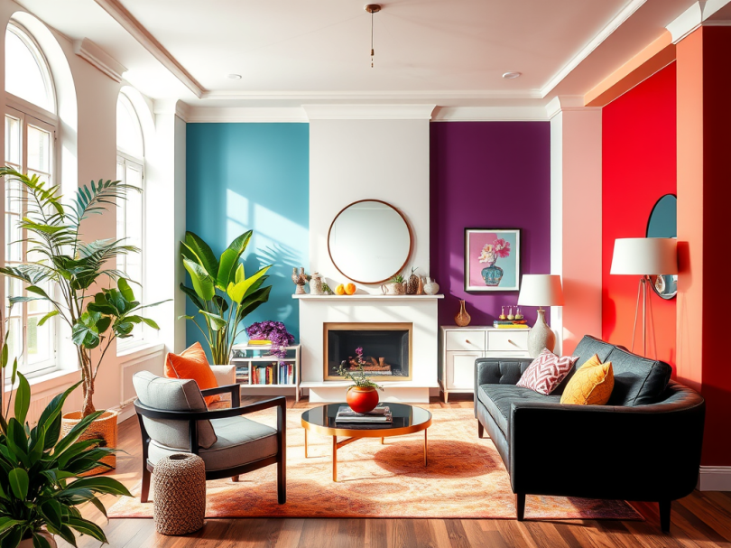
6. Add Your Personality

At the end of the day, your home should reflect you. Maybe that means painting one wall a deep navy blue behind your bed, or going bold with a warm clay tone in your entryway. Don’t be afraid to step outside of the “safe” neutrals if you’re craving something vibrant.

Color is one of the easiest ways to transform your space — and it’s just paint! You can always repaint later as your style evolves.


Final Thoughts

Choosing wall colors isn’t just about design — it’s about creating an atmosphere that feels right every time you walk through the door. Take your time, trust your instincts, and have fun experimenting.

Because when you find the right shade, you’ll know it — it’s the one that makes your home feel alive.


The Meaning of Colors: What Your Decor Might Be Saying


Have you ever walked into a room and instantly felt calm… or maybe energized, cozy, or even uneasy? That’s the power of color at work. The colors you surround yourself with don’t just make your space look good—they influence how you feel, think, and even behave.

Whether you’re picking paint for your walls, styling a new room, or just curious about what your favorite colors might say about you, understanding the meaning of colors can help you create a home that truly reflects and supports who you are.


Green – Balance, Growth, and Renewal

Green is the color of nature, and it brings harmony and freshness into a space. It’s perfect for living rooms, offices, or bathrooms—anywhere you want to feel relaxed and refreshed. Want to boost a sense of well-being? Add plants or accents in calming sage or deep forest green.


Yellow – Energy, Joy, and Optimism

Yellow is like sunshine in decor form. It lifts moods, sparks creativity, and adds cheerfulness. This color is great for kitchens, breakfast nooks, and kids’ play areas. Just remember—a little goes a long way. Overusing bright yellow can feel overwhelming.


Blue – Peace, Trust, and Calm

Blue is one of the most popular colors in home design, and for good reason. It evokes calm and serenity, especially in lighter shades. Navy adds sophistication, while soft blues promote tranquility—perfect for bedrooms and bathrooms.


Red – Passion, Power, and Excitement

Red is bold, intense, and full of emotion. It’s a great accent color for dining rooms or areas where you want to spark conversation and energy. However, too much red can be overstimulating, so balance it with neutrals or softer tones.


Purple – Luxury, Creativity, and Spirituality

Historically tied to royalty, purple is both luxurious and mysterious. It works beautifully in bedrooms, meditation spaces, or artistic corners of the home. Lavender brings softness and romance, while deeper purples convey drama and depth.


White – Purity, Simplicity, and Cleanliness

White opens up spaces, promotes clarity, and acts as a blank canvas for other elements. While it can feel sterile on its own, layering whites with textures or warmer tones makes it feel inviting and peaceful—perfect for minimalist or modern styles.


Black – Strength, Elegance, and Sophistication

Used thoughtfully, black adds drama and depth. It can ground a room and create contrast, especially when paired with lighter tones. Black accents or furniture can make a statement without overwhelming a space.


Orange – Warmth, Vitality, and Creativity

Orange is a friendly, high-energy color that’s great for social spaces like living rooms or home gyms. Terracotta or burnt orange shades feel cozy and modern, while brighter oranges scream fun and playfulness.


Brown – Stability, Comfort, and Earthiness

Brown tones—especially in wood furniture or decor—add warmth and grounding energy to your home. It’s comforting and timeless, making it ideal for dens, libraries, or any space where you want to feel secure.


Pink – Compassion, Love, and Softness

Pink can be sweet or sophisticated, depending on the shade. Blush tones are great for calm, romantic spaces, while brighter pinks offer a pop of playfulness and charm. Don’t be afraid to explore this color beyond just nurseries!


Final Thoughts: What Is Your Home Saying?

When decorating, you’re not just choosing a look—you’re crafting a feeling. The colors you choose communicate emotions, values, and even dreams. So take a moment, look around your home, and ask yourself: Does this feel like me?

If not, it might be time to pick up a paintbrush, swap out some throw pillows, or rethink your color palette. Because at the end of the day, your home should reflect not only your style—but also your soul.


Discover the Ideal Living Room Color Scheme: Tips & Ideas

Choosing the right color for your living room can transform the space from mundane to magical. Your living room is a central hub for relaxation, entertainment, and social gatherings, so the color scheme you choose should reflect your style, mood, and the ambiance you want to create. Here’s a guide to help you navigate the colorful world of living room design.

This blog includes affiliate links we may earn paid commissions if you choose to make a purchase after clicking a link, at no additional cost to you.

Understand the Basics of Color Theory

Before diving into specific colors, it’s important to grasp some basics of color theory. Colors can be broadly categorized into:

  • Warm Colors: Red, orange, and yellow. These colors evoke warmth, comfort, and energy.
  • Cool Colors: Blue, green, and purple. These colors are calming, relaxing, and can make a room feel more spacious.
  • Neutral Colors: White, gray, black, and beige. These colors provide a balanced backdrop and are versatile.

Consider the Room’s Function

Think about how you use your living room. Is it a lively space for family gatherings, or a serene sanctuary for relaxation?

  • Social Hub: If your living room is a bustling space for entertaining, consider warm, inviting colors like soft yellows, burnt oranges, or rich reds. These colors can stimulate conversation and make the room feel cozier.
  • Relaxation Retreat: For a more tranquil space, opt for cool colors like light blues, soft greens, or gentle purples. These hues can create a soothing atmosphere ideal for unwinding.

Assess the Room’s Natural Light

Natural light plays a crucial role in how colors appear in your living room. Take note of the following:

  • Bright, Sunlit Rooms: Rooms with plenty of natural light can handle bolder, darker colors without feeling overwhelming. Deep blues, vibrant greens, or even dark grays can work well.
  • Dimly Lit Rooms: If your living room lacks natural light, opt for lighter, brighter colors to avoid making the space feel cramped. Soft whites, light grays, and pastel shades can help reflect light and open up the room.
This blog includes affiliate links we may earn paid commissions if you choose to make a purchase after clicking a link, at no additional cost to you.

Complement Existing Furniture and Décor

Your living room’s color scheme should harmonize with your existing furniture and décor. Consider these tips:

  • Match Undertones: Ensure the color undertones of your walls complement the undertones of your furniture and décor. Warm undertones go well with warm colors, and cool undertones with cool colors.
  • Statement Pieces: If you have statement furniture or art, choose a neutral wall color to let these pieces shine. Conversely, if your furniture is more subdued, a bold wall color can add interest and character.

Experiment with Accent Walls

If you’re hesitant about committing to a single color, consider an accent wall. This approach allows you to introduce a bold color without overwhelming the space. Accent walls work particularly well behind focal points like a fireplace, a large piece of artwork, or a significant piece of furniture.

Test Before You Commit

Always test your chosen colors before fully committing. Paint small swatches on different walls and observe them at various times of the day. This helps you see how the color changes with the lighting and ensures you’re happy with your choice.

Popular Living Room Color Ideas

Here are some trending color ideas to inspire you:

  • Classic Neutrals: Timeless and versatile, neutrals like beige, taupe, and soft gray offer a serene backdrop for any style.
  • Earthy Greens: Shades like sage or olive bring a touch of nature indoors, promoting a peaceful and grounded atmosphere.
  • Moody Blues: Deep navy or soft sky blue can create a calming and sophisticated ambiance.
  • Warm Terracottas: These shades add warmth and richness, ideal for creating a cozy and inviting living space.

Color Collection Recommendations

Conclusion

Choosing the right color for your living room is a personal journey that combines your aesthetic preferences, the room’s functionality, and its natural light. By considering these factors and experimenting with different hues, you can find the perfect color that makes your living room a true reflection of your style and a space you love to spend time in. Happy decorating!