
Choosing colors for your home can feel surprisingly difficult. You may want warm, inviting, dramatic, relaxing, or sophisticated tones, but options create a COLOR COMBINATION that competes for attention.
The good news? You don’t have to reinvent COLOR COMBINATION.

Some color combinations have stood the test of time because they naturally complement one another. Therefore, color combinations provide balance, contrast, warmth, or visual interest without making a room feel chaotic. And when you understand why certain colors work together, choosing a color palette for your own home becomes much easier.

Whether you’re decorating a brand-new home, refreshing one room, or simply wondering how to make your space feel more put together, these COLOR COMBINATION schemes can give you a beautiful place to start.
Why Do Certain Color Combinations Become So Popular?
There is a reason certain color pairings seem to show up everywhere. Think navy and white, black and cream, green and beige, or chocolate brown and ivory. These combinations work because they create a visual relationship between colors.
Some provide contrast. Others are close enough in tone to feel calming and cohesive. Some introduce warmth while another color provides balance.
The secret isn’t necessarily choosing the “right” color. It’s choosing colors that have a relationship with one another.
Your home also needs more than one color to feel dimensional. Even a neutral room usually contains several shades—perhaps ivory walls, beige upholstery, warm wood, black accents, and soft brown textiles. The colors don’t have to match perfectly. In fact, they usually shouldn’t.
A thoughtfully layered color palette makes a home feel collected rather than decorated all at once.
1. Navy Blue and White
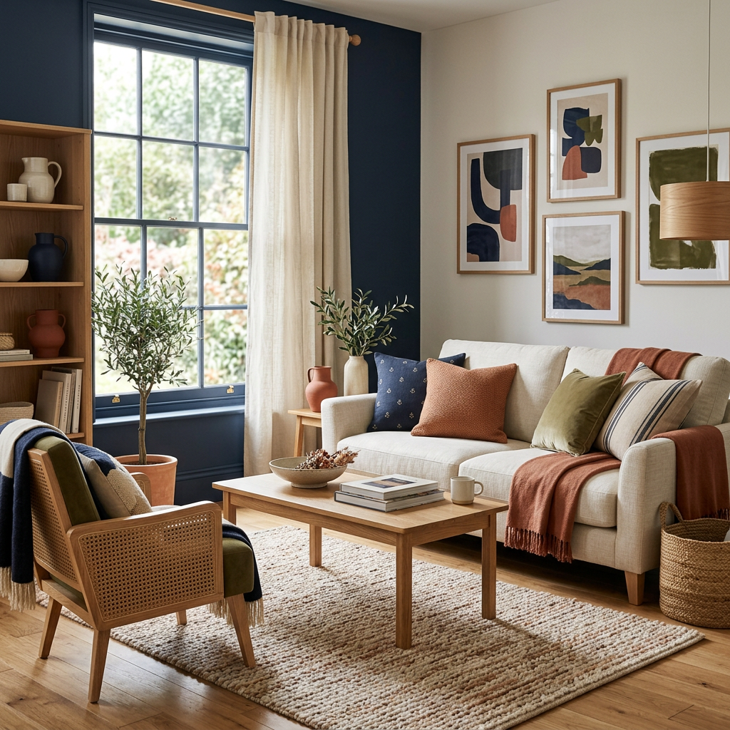
Few combinations are as timeless as navy blue and white. Navy provides depth and sophistication, while white keeps the overall look fresh and bright. The contrast between the two colors creates definition without feeling overly dramatic. This combination works beautifully in living rooms, bedrooms, bathrooms, kitchens, and even home offices.
Try navy through an accent wall, sofa, area rug, curtains, artwork, or decorative pillows while allowing white or ivory to occupy the larger portions of the room. For a softer look, introduce natural wood and warm beige. For something more polished, add brass or gold accents.
How to Make Navy and White Pop
Don’t stop at navy and white. Add a third color.
A few touches of:
- Warm wood
- Brass
- Camel
- Soft gray
- Natural greenery
can keep the room from feeling too predictable.
2. Green and Beige
A green and beige pairing has grown especially appealing, as it introduces a natural quality indoors. Green reminds us of plants, trees, gardens, and nature, while beige provides a warm neutral foundation. Together, they create a relaxed and organic atmosphere.
This pairing works particularly well for people who want a home that feels comfortable rather than overly formal. Consider sage green with warm beige for a softer space or a deeper forest green with cream and natural wood for something more dramatic.
Green doesn’t have to come from paint, either. Plants, artwork, pillows, rugs, and upholstered furniture can all introduce the color.
Why Green and Beige Work
Beige prevents green from becoming overwhelming, while green keeps beige from feeling flat.
It’s a classic example of a color combination where each shade makes the other look better.
3. Chocolate Brown and Cream
Chocolate brown is having a major moment, and it’s easy to understand why. Deep brown adds richness and warmth, while cream keeps the palette light enough to feel sophisticated rather than heavy.
This combination is particularly beautiful in fall and winter, but it can work year-round when balanced with lighter textures and natural materials. Imagine a cream-colored sofa paired with chocolate brown pillows, a dark wood coffee table, woven baskets, and warm metallic accents.
The result is cozy, elegant, and inviting.
Want to Make Brown Feel More Modern?
Layer different textures.
Try combining: Velvet + linen + leather + wood + woven textiles
When several textures share a similar color palette, the room gains dimension without needing a dozen different colors.
4. Black and Cream
Black and white will always be classic, but black and cream can create a softer and more sophisticated version of the same idea. Cream takes the edge off black while still providing enough contrast to make the room interesting.
This is an excellent palette for contemporary, transitional, modern farmhouse, and even traditional interiors.
Use black strategically rather than covering the entire room in it. Black picture frames, lighting fixtures, hardware, furniture legs, mirrors, and decorative objects can provide just enough contrast.
The Secret to Using Black
Think of black as punctuation. You don’t need a lot of it. A few intentional black accents can help define an otherwise neutral room and draw the eye around the space.
5. Terracotta and Cream
If you want your home to feel warm and welcoming, consider terracotta and cream. Terracotta introduces earthy warmth, while cream keeps the palette balanced. The combination has a natural, slightly Mediterranean quality that works beautifully with wood, woven materials, rattan, and aged metals. You can use terracotta in small doses through pillows, artwork, pottery, blankets, rugs, or accent furniture. This is especially useful if you love color but aren’t ready to commit to colorful walls.
6. Burgundy and Blush
Although Burgundy and blush may seem like an unexpected combination, the contrast can be surprisingly elegant. Burgundy is deep, dramatic, and sophisticated. Blush is soft, light, and delicate. Together, they create a palette with both richness and softness. This combination works particularly well in bedrooms, dining rooms, sitting areas, and spaces where you want a more romantic or luxurious atmosphere. Add cream, champagne, or warm gold to create an elevated look.
7. Gray and Warm Wood
Gray has long been a popular home décor neutral, but pairing it with warm wood keeps it from feeling cold. The contrast between cool gray and warm wood creates balance. If your room has gray walls, flooring, or furniture, introduce wood through a coffee table, dining table, shelving, picture frames, or decorative accessories. The wood adds warmth and natural character while gray provides a clean backdrop. If you’re worried about gray making your home feel sterile, this is one of the easiest ways to soften it.
8. Blue and Warm Beige
Blue and beige are another timeless combination that works because one color brings coolness while the other brings warmth. Light blue and beige can create a relaxed coastal-inspired feeling, while navy and camel can feel much more sophisticated. This palette works particularly well in bedrooms and living rooms because blue tends to create a calm visual atmosphere.
Try pairing:
Navy + camel + ivory
for a sophisticated look, or:
Soft blue + beige + white
for something lighter and more relaxed.
9. Olive Green and Black
If you want something moodier, olive green and black are worth considering. Olive has enough warmth and earthiness to prevent black from feeling too severe. Black, meanwhile, gives olive green structure and definition. Add cream or natural wood to keep the combination from becoming too dark. This palette can be especially striking in kitchens, offices, dining rooms, and living rooms.
10. Champagne, Graphite, and Ivory
For a more sophisticated and understated palette, consider combining champagne, graphite, and ivory. Graphite provides depth. Ivory creates softness and brightness. Champagne introduces subtle warmth and a touch of luxury. This combination works especially well when you want your home to feel polished without looking overly decorated.You can use graphite through furniture or accent pieces, ivory through walls and upholstery, and champagne through lighting, hardware, mirrors, textiles, and accessories. It’s proof that neutral doesn’t have to mean boring.

How Do You Make Your Home Pop With Color?
Choosing a color combination is only the beginning. The real magic happens when you decide where to use those colors.
You don’t need to paint every wall a bold color to make a room interesting. Sometimes the most effective approach is to let your primary color appear in unexpected places.
Try an Accent Wall
An accent wall can immediately change the personality of a room. Instead of painting the entire space a bold color, choose one wall and make it the focal point. Behind a bed, fireplace, television, dining table, or sofa can be excellent locations.
Use Color Through Accessories
If you’re nervous about committing to color, start small. Pillows, blankets, rugs, artwork, lamps, curtains, vases, books, and decorative objects can all introduce color without requiring a major renovation. This is also one of the easiest ways to change your home’s color palette seasonally.
Repeat Colors Throughout the Room
One of the simplest decorating tricks is color repetition. If you have navy blue in your artwork, repeat a little navy in your pillows and perhaps again in a rug or decorative accessory. You don’t need the items to match exactly. They simply need to relate. Repeating a color throughout the room helps create visual continuity and makes the design feel intentional.
Add a Bold Color to a Neutral Room
If your room is primarily beige, cream, white, gray, or brown, you have an excellent opportunity to introduce a stronger color.
Try adding:
Emerald green + cream
Burgundy + beige
Navy + ivory
Terracotta + cream
Chocolate brown + champagne
One or two bold colors can completely transform a neutral room.
Don’t Forget the Ceiling
Your ceiling doesn’t always have to be white. A soft blue ceiling can make a bedroom feel dreamy. A warm cream can make a room feel cozy. A deeper color can create a dramatic, intimate atmosphere. Even if you aren’t ready for a colorful ceiling, consider using the same paint color on the walls and ceiling in a lighter or softer finish.
Let Your Artwork Choose the Palette
Here’s a decorating trick that can save you a lot of frustration: start with something you already love. It could be a piece of artwork, a rug, a patterned pillow, a favorite chair, or even a beautiful piece of fabric. Pull two or three colors from that item and use them throughout the room. Instead of trying to find artwork that matches your room, let the artwork help determine the room’s color palette.
How Many Colors Should You Use in a Room?
There isn’t a strict rule, but the classic 60-30-10 decorating rule is a useful starting point.
Think of it as:
60% — Dominant color
This is usually your walls, large furniture pieces, or flooring.
30% — Secondary color
This might appear in curtains, rugs, accent furniture, or larger accessories.
10% — Accent color
This is where you can have some fun with pillows, artwork, decorative objects, lighting, or smaller accessories. The percentages don’t need to be mathematically perfect. The idea is simply to create visual hierarchy. You want one color to dominate, another to support it, and a smaller amount of color to grab attention.
The Biggest Color Mistake to Avoid
One of the biggest mistakes homeowners make is trying to make everything match.
You don’t need your sofa to match your curtains.
Your pillows don’t have to match your rug perfectly.
Your artwork doesn’t have to contain every color in the room.
And your entire home doesn’t need to use the exact same palette.
Instead, look for coordination rather than matching.
Colors that share a similar undertone, intensity, or temperature will often work together even when they aren’t identical.
That slight variation is what gives a room personality.

Your Home Doesn’t Need More Color—It Needs the Right Color
Color has the ability to completely change how your home feels.
It can make a room feel warmer, brighter, calmer, more dramatic, more luxurious, or more energetic. But you don’t need to follow every color trend to create a beautiful home.
Start with the colors you naturally gravitate toward. Look at the furniture and décor you already own. Pay attention to the colors that make you feel comfortable when you walk into a room.
Then build from there.
Whether you love navy and white, green and beige, chocolate brown and cream, burgundy and blush, or a sophisticated combination of graphite, champagne, and ivory, the goal isn’t to create a room that looks like everyone else’s.
The goal is to create a home that feels like you.
Because the best color palette isn’t simply the one that’s trending.
It’s the one that makes you want to come home.


Deja un comentario