
There’s something about orange that instantly sparks a reaction. You either love it… or you’re a little afraid of it.
And honestly? That fear makes sense.
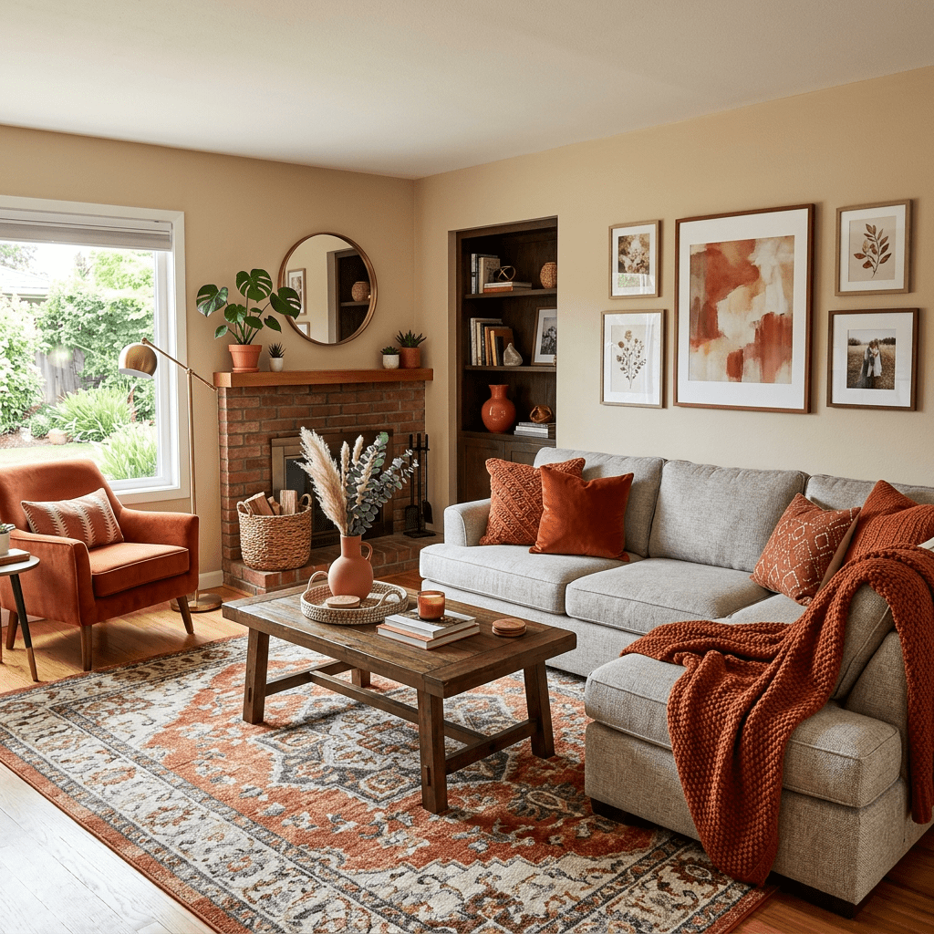
Orange is bold. It’s energetic. It doesn’t whisper—it speaks. But when used the right way, orange can completely transform your home into a warm, inviting, and beautifully styled space that feels intentional—not overwhelming.
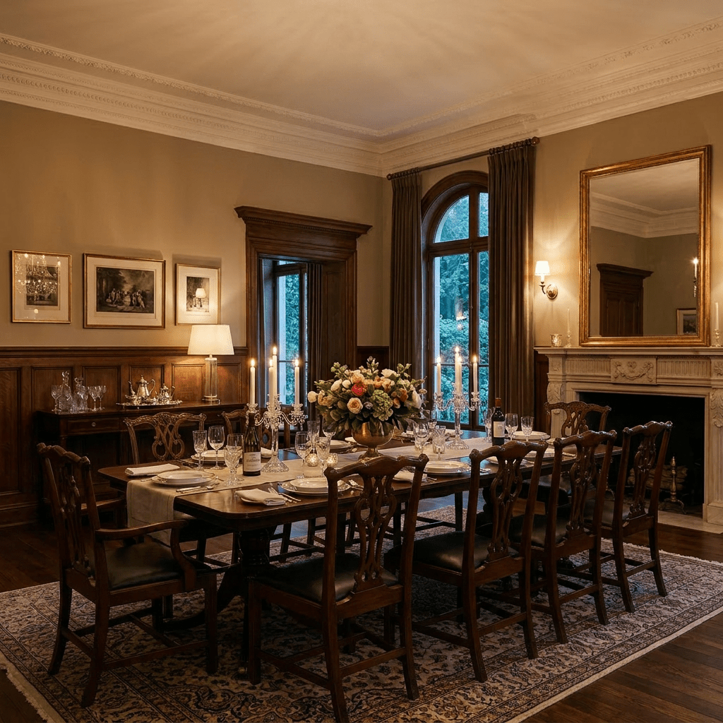
Orange sits between red and yellow on the color wheel, which means it naturally carries both the warmth of red and the happiness of yellow. Because of this combination, it has a unique ability to energize a space while still making it feel cozy. This is one of the reasons designers often use orange in spaces meant for gathering, such as living rooms and dining areas—it encourages connection, conversation, and comfort.
So the real question isn’t “Is orange too much?”
It’s “How do I use orange the right way?”
A Quick Story: When Orange Almost Took Over
April had just moved into her first apartment. She wanted her space to feel happy, warm, and full of life—something that felt like her.
So she chose orange.
At first, it was just a throw pillow. Then a blanket. Then a rug. Then curtains. Then wall art.
Before she knew it… her living room didn’t feel cozy—it felt loud. Like walking into a sunset that never ended.
What April experienced is actually very common. When a bold color like orange is layered repeatedly without contrast, the eye doesn’t get a place to rest. This creates visual overload, making the space feel smaller and more chaotic than it actually is. Balance—not removal—is what fixes this.
Frustrated, she almost gave up on orange completely.
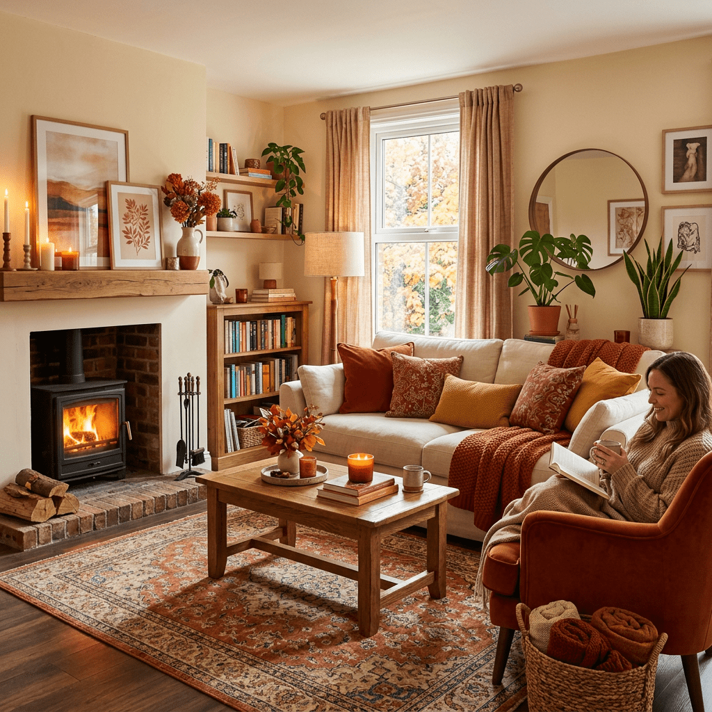
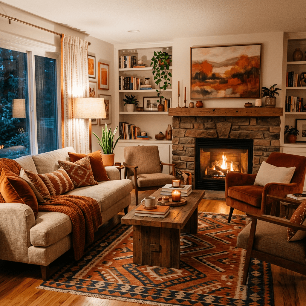
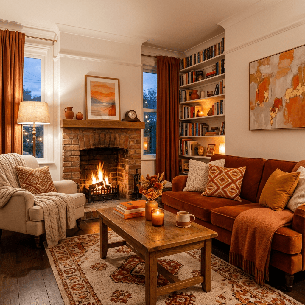
But instead of removing it, she refined it.
She swapped the bright neon tones for burnt orange. She paired it with soft creams and warm wood tones. She kept a few statement pieces and let the rest of the room breathe.
And just like that—her space didn’t feel overwhelming anymore.
It felt warm. Elevated. Intentional.
Is Orange a Good Color for Home Decor?
Yes—orange is an incredible color for home decor when used thoughtfully.
From a design perspective, orange is considered a stimulating color, meaning it can increase energy levels and even influence mood. However, unlike red—which can sometimes feel intense or dramatic—orange tends to feel more approachable and livable, especially in muted tones.
Orange is also widely used in biophilic and nature-inspired design, because it reflects tones found in clay, sunsets, autumn leaves, and natural landscapes. Incorporating these tones can make your home feel more grounded and connected to the outdoors.
Why Orange Works So Well:
- ✔ Creates a warm and inviting atmosphere
- ✔ Adds energy and personality to a space
- ✔ Pairs beautifully with neutrals and natural textures
- ✔ Works across multiple styles (modern, boho, cozy, luxe)
The Secret: It’s All About the Shade
Not all orange is created equal—and this is where most people go wrong.
Highly saturated oranges reflect more light and demand attention, which is why they can feel overwhelming when overused. On the other hand, muted or earthy oranges absorb more light and blend more naturally into a space, making them easier to style.
Best Orange Tones for Home Decor:
- Burnt Orange → Warm, cozy, and sophisticated
- Terracotta → Earthy and calming
- Rust → Perfect for timeless, layered decor
- Peachy Orange → Soft and airy
Tones to Use Carefully:
- Neon orange
- Bright citrus orange
These tones are best used in small, controlled accents rather than large surfaces.
How to Incorporate Orange Without Overwhelming Your Space
1. Start Small (The Safest Way)
If you’re new to orange, don’t commit to big pieces right away.
Using smaller decor items allows you to test how the color interacts with your lighting, furniture, and existing palette. Since color can look very different depending on natural and artificial lighting, this step helps you avoid costly mistakes.
Try:
- Throw pillows
- Blankets
- Small decor accents
- Candles or vases
2. Pair Orange with Neutrals
Orange shines best when it has balance.
Neutrals act as a visual “reset,” allowing bold colors to stand out without overwhelming the space. This contrast is what creates that polished, designer look.
Perfect pairings:
- Ivory
- Beige
- Soft white
- Light gray
- Warm wood tones
3. Use Orange as an Accent, Not the Main Event
Think of orange like the highlight, not the whole story.
In interior design, this is often referred to as the 60-30-10 rule:
- 60% dominant color (usually neutral)
- 30% secondary color
- 10% accent color (this is where orange works beautifully)
Instead of:
Orange walls + orange couch + orange rug
Try:
Neutral base + orange accents
4. Choose One Statement Piece
If you love bold decor, pick one standout item.
This creates a focal point, which gives your space structure and intention. Without a focal point, bold colors can feel scattered.
Ideas:
- A burnt orange accent chair
- A statement canvas wall art piece
- A patterned rug with hints of orange
5. Bring in Texture to Soften the Look
Texture plays a major role in how color is perceived.
Soft textures like linen and cotton diffuse color, making it feel more relaxed, while glossy or smooth surfaces can intensify it. Mixing textures helps orange feel layered and inviting rather than harsh.
6. Use Orange Seasonally
Not ready to commit year-round?
Orange is naturally associated with fall, making it one of the easiest colors to rotate into your home seasonally. Swapping textiles and small decor pieces can give your home a refreshed look without a full redesign.
Where Orange Works Best in Your Home
Orange can work in almost any room—when styled correctly.
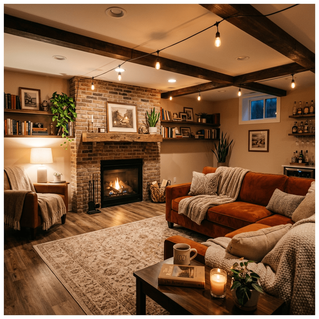
Spaces that benefit most from orange are those where warmth and energy are desired. However, in areas meant for relaxation—like bedrooms—softer tones should be used to maintain a calm environment.
Living Room
- Pillows, throws, wall art
- Accent chairs
Bedroom
- Soft peach or rust bedding
- Cozy layered textiles
Kitchen
- Small appliances
- Dishware or decor accents
Bathroom
- Towels
- Subtle patterned shower curtains
Final Thoughts: Orange Done Right Feels Like Home
Orange isn’t too much—it’s just powerful.
And when you understand how to balance it, soften it, and style it, it becomes one of the most beautiful colors you can bring into your home.
You don’t need a lot of it—you just need the right amount in the right places.
Ready to Style Your Space?
If you’re looking for beautiful, cozy, and stylish home decor pieces that help you bring colors like orange into your space without the overwhelm, explore more at:
Discover comfort. Discover purpose. Discover life.

Leave a comment