
Sometimes the most beautiful rooms aren’t created by following the rules—they’re created by breaking them.
When most people decorate their homes, they instinctively choose colors that are considered “safe.” White with gray. Beige with cream. Navy with white. These combinations have stood the test of time because they’re easy to coordinate and difficult to get wrong.

But what if the most memorable room in your home wasn’t built around predictable colors?
Some of the most stunning interiors feature color combinations that, at first glance, seem completely incompatible. Yet somehow they create spaces filled with personality, warmth, and visual interest. The secret isn’t choosing colors that naturally belong together—it’s understanding why unlikely combinations work.
Let’s explore some of the most unexpected color pairings that can transform an ordinary room into one that guests never forget.
Why Unlikely Color Combinations Work
Great design is about balance.
When two unexpected colors share a space, they create visual tension. Our brains naturally notice contrast because it keeps a room interesting. Instead of everything blending together, each color enhances the beauty of the other.
Unexpected combinations also:
- Create personality
- Make a room feel custom-designed
- Add depth and dimension
- Prevent a home from feeling overly trendy
- Tell a unique story
Think of your favorite outfit. Sometimes the pieces that shouldn’t match become the most fashionable combination. The same is true with home decorating.
What Makes a Color Combination “Unlikely”?
An unlikely color combination usually includes colors that people don’t traditionally pair together because they:
- Sit opposite each other emotionally
- Have very different temperatures
- Belong to different decorating styles
- Compete for attention
- Rarely appear together in nature
Yet with thoughtful styling, these opposites become surprisingly harmonious.
1. Burgundy and Olive Green
This pairing sounds heavy. But together? It’s luxurious. Burgundy brings warmth and richness while olive green grounds the room with an earthy elegance.
Perfect for:
- Dining rooms
- Libraries
- Bedrooms
- Offices
Add brass lighting and natural wood to soften the richness.
2. Lavender and Mustard Yellow
Most people would never think to combine these. Lavender feels delicate. Mustard feels bold. Together they create an artistic, vintage-inspired space that feels cheerful without being childish. Use lavender as the larger color and mustard as an accent through:
- Throw pillows
- Artwork
- Lamps
- Decorative pottery

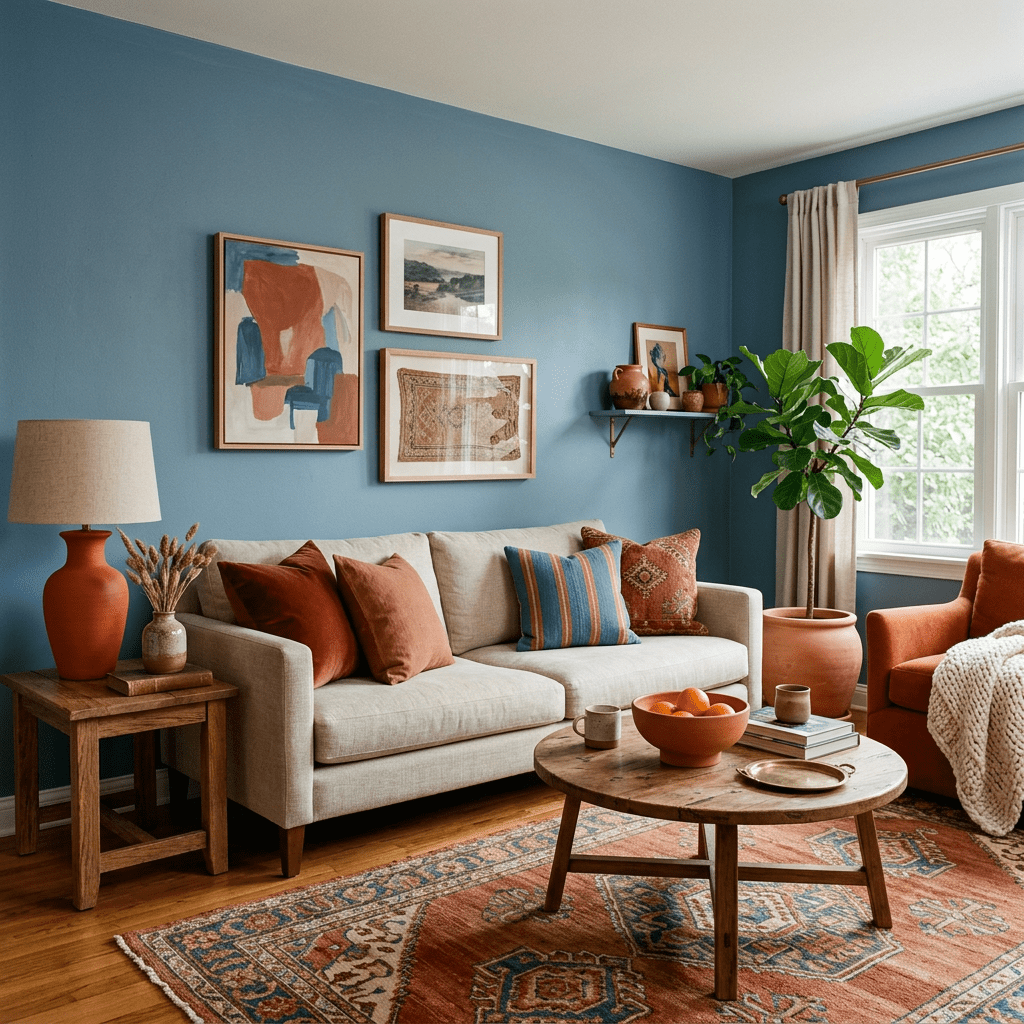
3. Terracotta and Dusty Blue
Warm meets cool. Earth meets sky. Terracotta provides warmth while dusty blue introduces calm. The result feels collected rather than coordinated. This combination works beautifully in:
- Living rooms
- Kitchens
- Outdoor spaces
Natural linen makes the colors feel even softer.
4. Pink and Forest Green
Many assume pink belongs only in feminine spaces. Forest green changes that completely. The deep green gives pink maturity and sophistication.
Try:
- Emerald velvet chairs
- Soft blush walls
- Dark green cabinets
- Pink artwork
The contrast creates a boutique hotel feel.
5. Black and Camel
Black can sometimes feel harsh. Camel softens it immediately. Together they feel modern, timeless, and incredibly elegant. This pairing shines in minimalist homes. Layer different textures like:
- Leather
- Wool
- Linen
- Wood
- Matte metal
The texture keeps the palette from feeling flat.
6. Navy Blue and Rust Orange
These colors almost seem too strong together. Yet they’re one of the richest combinations available. Navy acts like a neutral. Rust adds warmth and energy. Use navy on larger surfaces while introducing rust through:
- Pillows
- Curtains
- Rugs
- Artwork
The result feels cozy without becoming overly seasonal.

7. Chocolate Brown and Sky Blue
Brown has made an incredible comeback in interior design. Pairing it with bright sky blue keeps it fresh. Instead of feeling heavy, brown becomes welcoming. This combination is perfect for:
- Family rooms
- Bedrooms
- Reading corners
Add cream to tie everything together.
8. Teal and Burnt Orange
These colors are technically complementary. Yet many people hesitate because both are bold. The secret? Let one dominate. Choose teal walls with burnt orange accessories or vice versa. Avoid equal amounts. One should always lead while the other supports.
9. Plum and Sage Green
Plum feels dramatic. Sage feels peaceful. Together they create balance. This pairing feels romantic without becoming overwhelming. Ideal for:
- Guest bedrooms
- Formal dining rooms
- Entryways
Gold hardware elevates the entire palette.
10. Charcoal Gray and Peach
Gray has become one of today’s decorating staples. Adding peach completely changes its personality. Instead of feeling cold, charcoal becomes approachable. Peach adds warmth without overwhelming the space. This combination works especially well in modern apartments.
11. Red and Light Blue
Many people associate red and blue with patriotic themes, but the right shades tell a completely different story. A muted brick red paired with a soft powder blue creates a sophisticated, European-inspired palette. Think antique rugs, painted furniture, vintage artwork, and natural oak flooring. The key is avoiding bright primary shades. Softer, more muted tones create harmony instead of high contrast.
12. Emerald Green and Soft Pink
This combination feels luxurious because it combines one jewel tone with one gentle pastel. Emerald provides depth. Soft pink adds lightness. Together they create a glamorous look without feeling overdone. Velvet fabrics, gold accents, and marble surfaces make this pairing especially striking.
The Secret: One Color Should Lead
One of the biggest mistakes people make is giving each bold color equal visual weight.
Instead, use the 60-30-10 rule:
- 60% Primary color (walls, large furniture)
- 30% Secondary color (curtains, rugs, accent chairs)
- 10% Accent color (pillows, artwork, décor)
This approach allows bold combinations to feel intentional rather than chaotic.
Texture Is the Hidden Ingredient
Unexpected colors become easier to live with when you layer texture.
For example:
- Velvet softens jewel tones.
- Linen lightens dark colors.
- Natural wood warms cool palettes.
- Woven baskets add organic contrast.
- Stone, marble, and ceramic provide visual relief.
Texture creates balance even when colors are bold.
Bring in a Neutral Anchor
Every daring color palette benefits from a grounding element. Neutrals such as ivory, cream, warm white, taupe, or natural oak prevent the room from feeling visually overwhelming. Think of a neutral as the bridge connecting every bold choice.
Repeat Each Color Throughout the Room
A common reason unusual combinations feel “off” is that each color appears only once. If you use mustard yellow in a throw pillow, repeat it elsewhere:
- Artwork
- Flowers
- Books
- A vase
- A candle
- A patterned rug
Repeating colors creates rhythm and makes the design feel intentional.
Use Nature as Your Inspiration
Some of the world’s best color combinations already exist outdoors.
Think about:
- Sunsets (orange, lavender, dusty blue)
- Forests (green, brown, cream)
- Tropical flowers (pink, teal, yellow)
- Mountains (charcoal, sage, sky blue)
- Desert landscapes (terracotta, olive, sand)
Nature proves that unexpected colors can coexist beautifully.
Confidence Is the Final Design Element
The biggest difference between a room that feels odd and one that feels extraordinary is confidence. When every design choice has intention, even unusual colors feel cohesive.
Trust your instincts. Start with small accents if you’re hesitant, and build from there. Sometimes the combinations that make you pause are the ones that create the most memorable spaces.
Your home should reflect your personality, not just the latest trend. If a color pairing makes you smile every time you walk into the room, that’s often the strongest sign that it belongs.

Final Thoughts
Decorating isn’t about following a rigid set of rules—it’s about creating a home that feels authentic to you. Unlikely color combinations invite creativity, encourage self-expression, and often result in spaces with far more character than traditional palettes.
Don’t be afraid to experiment with samples, textiles, and accessories before making a major commitment. The most captivating interiors are rarely the ones that played it safe. They are the ones where someone had the courage to combine the unexpected—and discovered something beautiful.
When you embrace colors that surprise you, you create a home that feels personal, welcoming, and unforgettable.


Leave a comment