

When most people hear the word rainbow, they picture something bright, playful, and full of color. The idea of RAINBOW COLOR in décor can feel exciting yet overwhelming. Red, orange, yellow, green, blue, indigo, and violet all come together in one beautiful display.

In home décor, bringing all those colors into one space can feel intimidating. However, with thoughtful planning, you can use multiple colors without making the room chaotic. Is rainbow décor too much? Can you really use multiple colors in your home without making the room feel chaotic, childish, or overwhelming?

The answer is yes—you absolutely can use rainbow colors in your home. The secret is not necessarily using less color. It is learning how to use color with intention.
Rainbow-inspired decorating doesn’t have to mean covering your room in every color imaginable. It can be as subtle as incorporating a few carefully selected colors throughout the room, choosing artwork that contains multiple shades, or using a neutral foundation that allows colorful accessories to become the stars of the space.
Why Do We Love Rainbow Colors?
Color has a powerful effect on how a room feels. Certain colors can make a space feel warm, energetic, peaceful, dramatic, sophisticated, or playful. When you bring several colors together, you have the opportunity to create a room that feels expressive and full of personality.
Rainbow colors can also represent individuality. Not everyone wants a beige, gray, or monochromatic home. Some people genuinely enjoy color and want their homes to reflect their personality, creativity, and optimism.
There is something naturally cheerful about seeing multiple colors together. A colorful room can feel welcoming and energetic, especially when the colors are balanced properly.
The problem isn’t necessarily too much color.
The problem is too much competing color.
Can Rainbow Décor Be Too Much?
Absolutely.
Imagine walking into a room where the curtains are bright red, the sofa is royal blue, the walls are yellow, the rug is purple, the pillows are green and orange, and every piece of artwork introduces another combination of colors.
Each individual item might be beautiful, but together they may compete for attention.
This is where rainbow decorating can go wrong.
A room needs visual resting places. Your eyes should have somewhere to pause between colorful elements. That’s why neutrals can be so important when you’re decorating with multiple colors.
White, ivory, cream, beige, gray, black, natural wood, and other muted finishes can give colorful décor room to breathe.
Think of neutrals as the background music of your room. They don’t necessarily need to be the main attraction, but they help everything else work together.
Rainbow Doesn’t Have to Mean Bright
One of the easiest ways to make rainbow décor feel more sophisticated is to move away from extremely bright primary colors.
Instead of using a bright red, consider burgundy, terracotta, or dusty rose.
Instead of neon yellow, try mustard, ocher, or warm gold.
Instead of bright green, consider sage, olive, or forest green.
Instead of electric blue, try navy, denim, or muted teal.
Instead of intense purple, consider plum, mauve, or lavender.
You are still using the rainbow as inspiration, but the overall effect becomes more mature and intentional.
This is particularly useful if you love color but don’t want your home to feel like a children’s playroom.

Start With a Neutral Foundation
One of the best ways to successfully decorate with multiple colors is to begin with a neutral foundation.
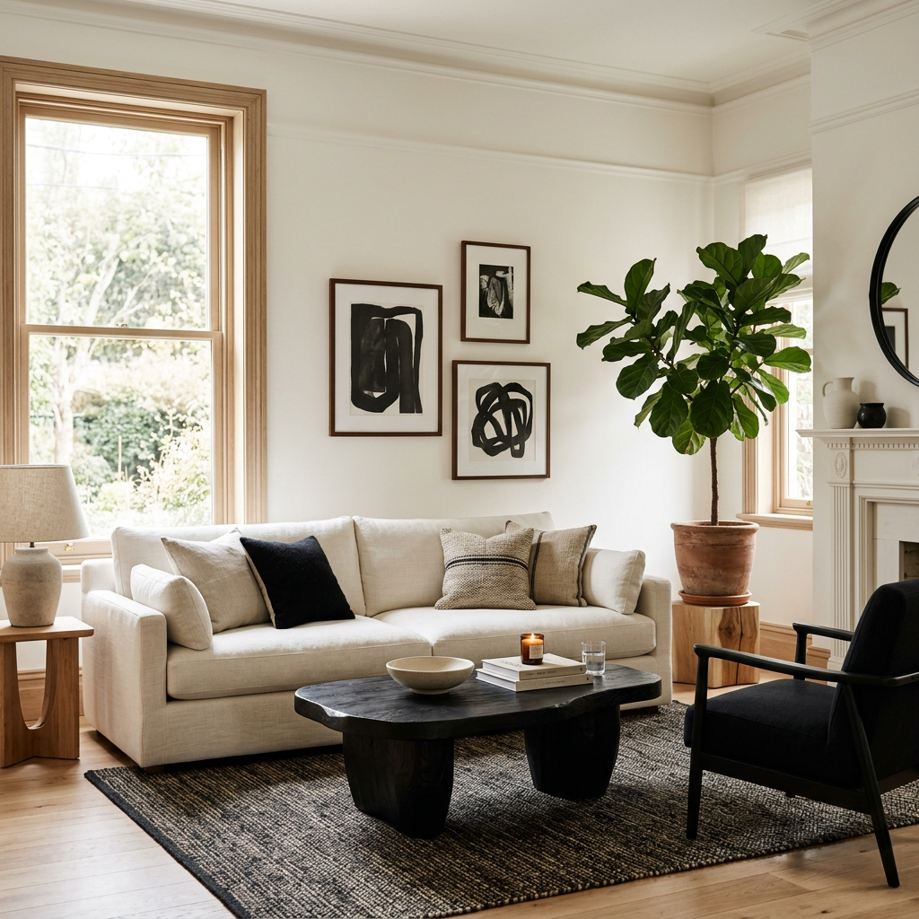
Imagine a living room with an ivory sofa, natural wood furniture, cream walls, and a neutral area rug. Now introduce colorful pillows containing shades of blue, green, yellow, pink, and orange.
Suddenly, the room has plenty of color without feeling overwhelmed.
The same concept can work in a bedroom. Keep the bed, walls, and larger furniture relatively neutral and allow colorful artwork, blankets, pillows, lamps, or accessories to introduce the rainbow.
This approach also gives you flexibility. If you decide you want to change the color scheme later, you don’t have to replace all of your major furniture.
Choose a Color Story
Here’s an important secret to making rainbow decorating work:
The colors don’t have to match perfectly, but they should relate to one another.
A colorful piece of artwork can become your inspiration.
Let’s say your artwork contains navy blue, sage green, mustard yellow, terracotta, blush pink, and cream. Rather than randomly adding every color you see, choose two or three of those shades to repeat throughout the room.
Maybe you use navy in a throw pillow, mustard in a decorative vase, and terracotta in a small piece of artwork.
Now the colors feel connected.
This creates what designers often refer to as a color story.
The room isn’t simply colorful. It has a visual conversation happening between the different elements.
Use One Rainbow Piece as the Star
If you’re nervous about incorporating multiple colors, start with one statement piece.
A colorful area rug can become the foundation for an entire living room.
A large piece of rainbow-inspired artwork can become the focal point above a sofa.
A colorful quilt can become the centerpiece of a bedroom.
A vibrant shower curtain can introduce personality into an otherwise neutral bathroom.
Once you’ve chosen your statement piece, pull smaller colors from it and repeat them throughout the room.
This is much easier than trying to select individual rainbow-colored pieces one at a time.
Try a Rainbow Gallery Wall
A gallery wall is another great way to experiment with color without committing your entire room to a rainbow palette.
You could create a collection of artwork that includes different colors while keeping the frames consistent.
For example, black, white, or natural wood frames can create a visual connection between colorful prints.
The artwork becomes colorful while the frames provide consistency.
This is a particularly effective way to use rainbow colors in a hallway, office, bedroom, or living room.
Add Color Through Accessories
If you love neutral furniture but want more personality, accessories are your best friend.
Think about:
- Throw pillows
- Blankets
- Vases
- Candles
- Books
- Artwork
- Decorative objects
- Lamps
- Curtains
- Rugs
- Plants and colorful planters
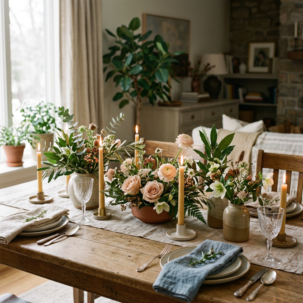
- Table settings
Accessories allow you to experiment with color without making a major financial commitment.
This can be especially helpful if you are renting or simply aren’t ready to paint your walls or purchase colorful furniture.
Don’t Forget About Texture
Color isn’t the only way to make rainbow décor interesting.
Texture can help create sophistication.
Imagine a room with velvet pillows, a woven basket, a chunky knit blanket, a ceramic vase, a wood coffee table, and a colorful rug.
Even though there are multiple colors present, the textures help create depth.
This is one of the easiest ways to prevent colorful décor from looking flat or overly themed.
Rainbow Décor Doesn’t Have to Be Literal
You don’t necessarily need a piece of décor that actually displays a rainbow.
Instead, you can create a rainbow-inspired room.
For example, your living room could contain:
A terracotta pillow.
A mustard vase.
A deep green plant pot.
A navy throw.
A blush-colored artwork.
A lavender decorative object.
Individually, none of these pieces screams “rainbow.”
Together, however, they create a colorful spectrum.
This approach can be much more sophisticated than using obvious rainbow imagery throughout the room.
Try a Tonal Rainbow
Another beautiful approach is using different shades of the same color family.
Instead of using the brightest version of every rainbow color, choose muted or earthy versions.
Think terracotta, peach, mustard, olive, teal, dusty blue, mauve, and plum.
The result is still colorful, but the palette feels cohesive.
This works especially well with modern, bohemian, eclectic, vintage, and transitional decorating styles.
Keep Your Largest Pieces Simple
If you’re going to use a lot of color, consider keeping your largest furniture pieces relatively simple.
A neutral sofa is incredibly versatile.
A natural wood dining table can work with almost any color palette.
An ivory bed can support colorful bedding.
A black or white bookcase can display colorful accessories beautifully.
Large pieces take up a lot of visual space. Keeping them neutral gives you more freedom to play with color in smaller areas.
What About the Kitchen?
The kitchen is another place where rainbow colors can work beautifully.
You don’t have to purchase colorful cabinets to make it happen.
Try colorful dishes, glassware, kitchen towels, artwork, canisters, cutting boards, or small appliances.
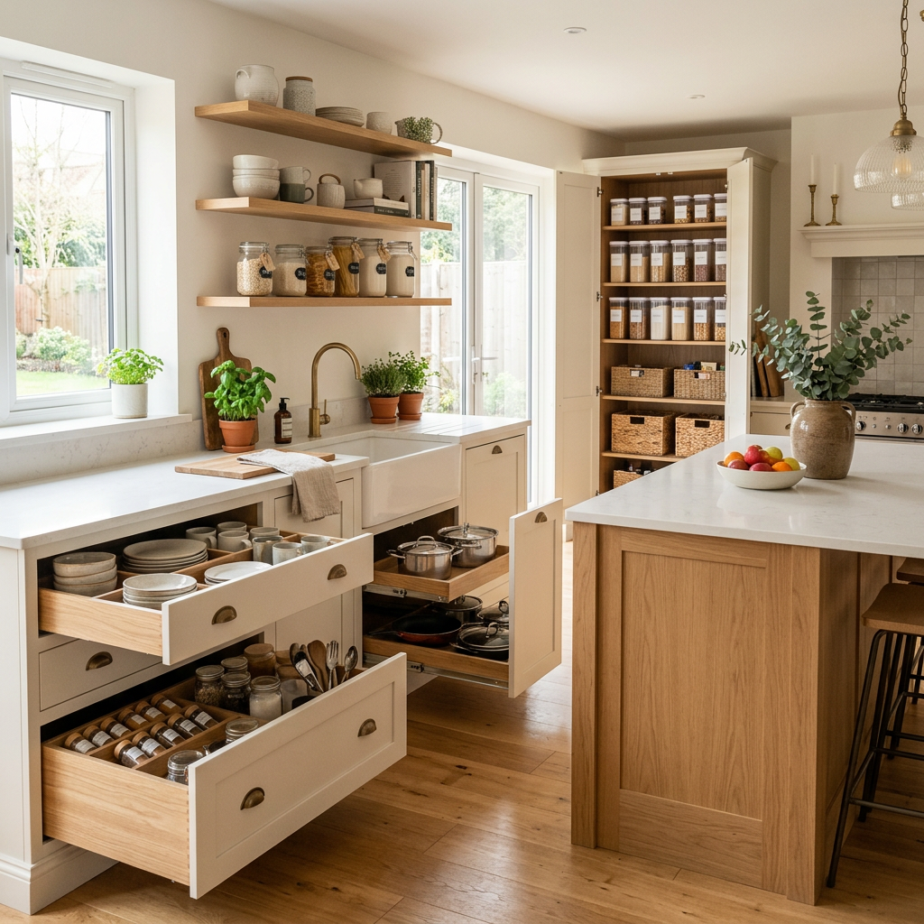
A neutral kitchen can actually be the perfect canvas for colorful accessories.
Imagine a white kitchen with natural wood accents and a collection of colorful ceramic dishes displayed on open shelving. The color becomes part of the décor rather than making the kitchen feel overly decorated.
What About the Bathroom?
Bathrooms are perfect places to experiment.
Because bathrooms are often smaller spaces, you can make a stronger statement without having to decorate an entire house around the color scheme.
A colorful shower curtain, patterned bath mat, artwork, towels, and accessories can completely transform a neutral bathroom.
If you want the room to feel sophisticated, choose a rainbow-inspired pattern with muted or earthy colors rather than extremely bright primary shades.
The 60-30-10 Rule Can Help
If you’re struggling with how much color to use, the traditional 60-30-10 decorating rule can give you a starting point.
Approximately 60% of the room can be your dominant color or neutral foundation. About 30% can be a secondary color.
The remaining 10% can be an accent color. You don’t have to follow this rule perfectly. Think of it as a framework rather than a decorating law.
When working with a rainbow-inspired palette, you can treat the entire collection of accent colors as part of that smaller percentage rather than giving every rainbow color equal attention.
How to Make Rainbow Décor Feel Grown-Up
If you’re worried that rainbow décor will look childish, focus on quality, proportion, and restraint. Choose sophisticated materials. Use beautiful artwork. Incorporate natural textures. Mix in neutral colors. Choose muted versions of bright colors. Repeat colors intentionally.
Avoid putting every color in exactly the same proportion. And most importantly, give your room some breathing room. A sophisticated colorful home isn’t necessarily one where you see color everywhere. It’s one where every color appears to have a purpose.

Rainbow Décor Is About Personality
At the end of the day, decorating your home isn’t about following a rule that says you can only use three colors or that neutral rooms are more sophisticated. Your home should reflect the people who live there.
If you love color, there is no reason your home has to be completely neutral. The key is learning how to control the color instead of allowing the color to control the room.
Rainbow-inspired decorating can be bold, sophisticated, playful, elegant, modern, eclectic, or completely unique to you. You don’t have to choose between a colorful home and a sophisticated home.
You can have both.
Start with a neutral foundation, choose a color story, introduce color intentionally, and let your personality guide the rest. Because the most beautiful home isn’t necessarily the one with the perfect color palette. It’s the one that feels like you.
Discover comfort. Discover purpose. Discover life with meaningful home décor.

Leave a Reply